Clerestory Magazine

Publication Design

2022

  • Print

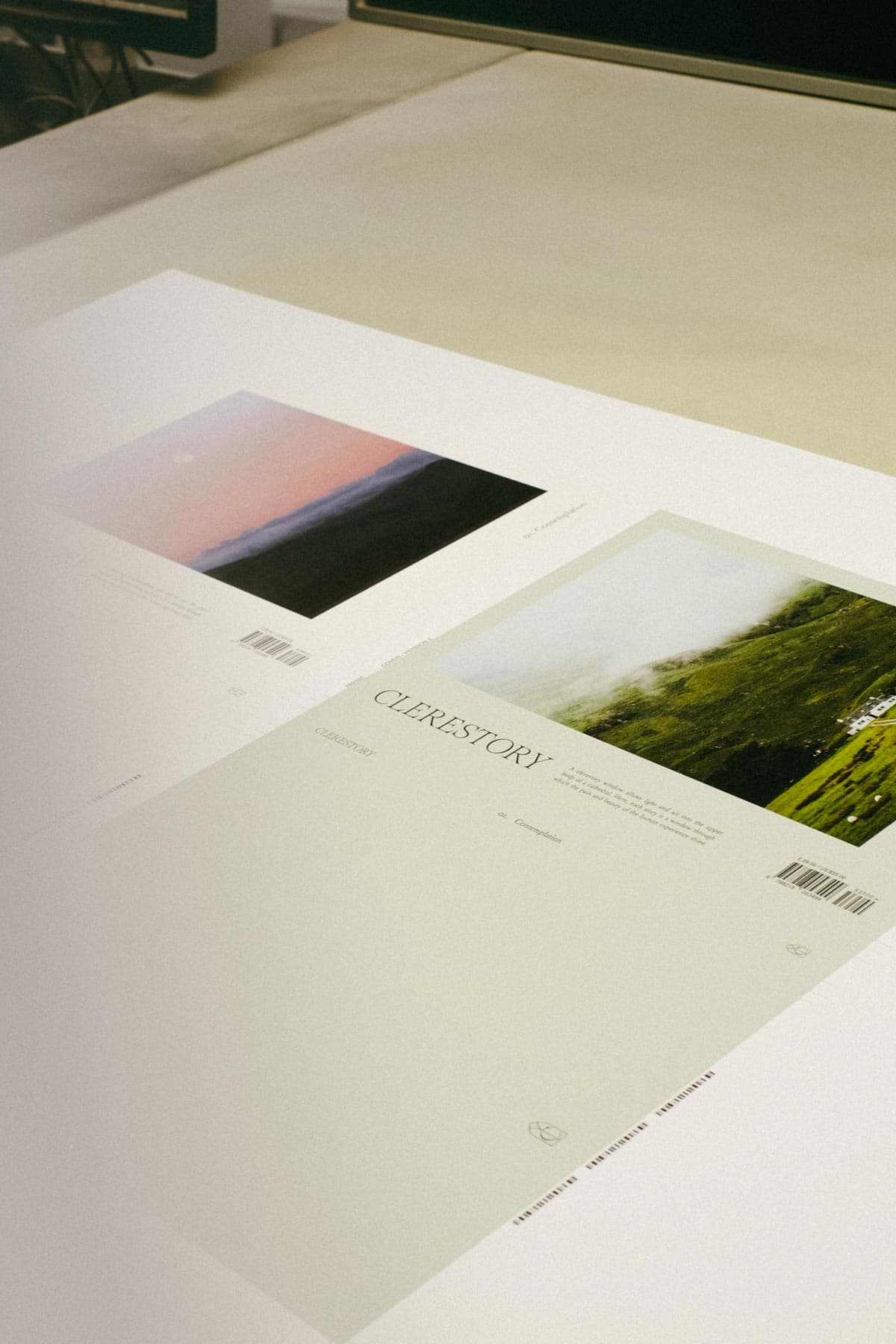
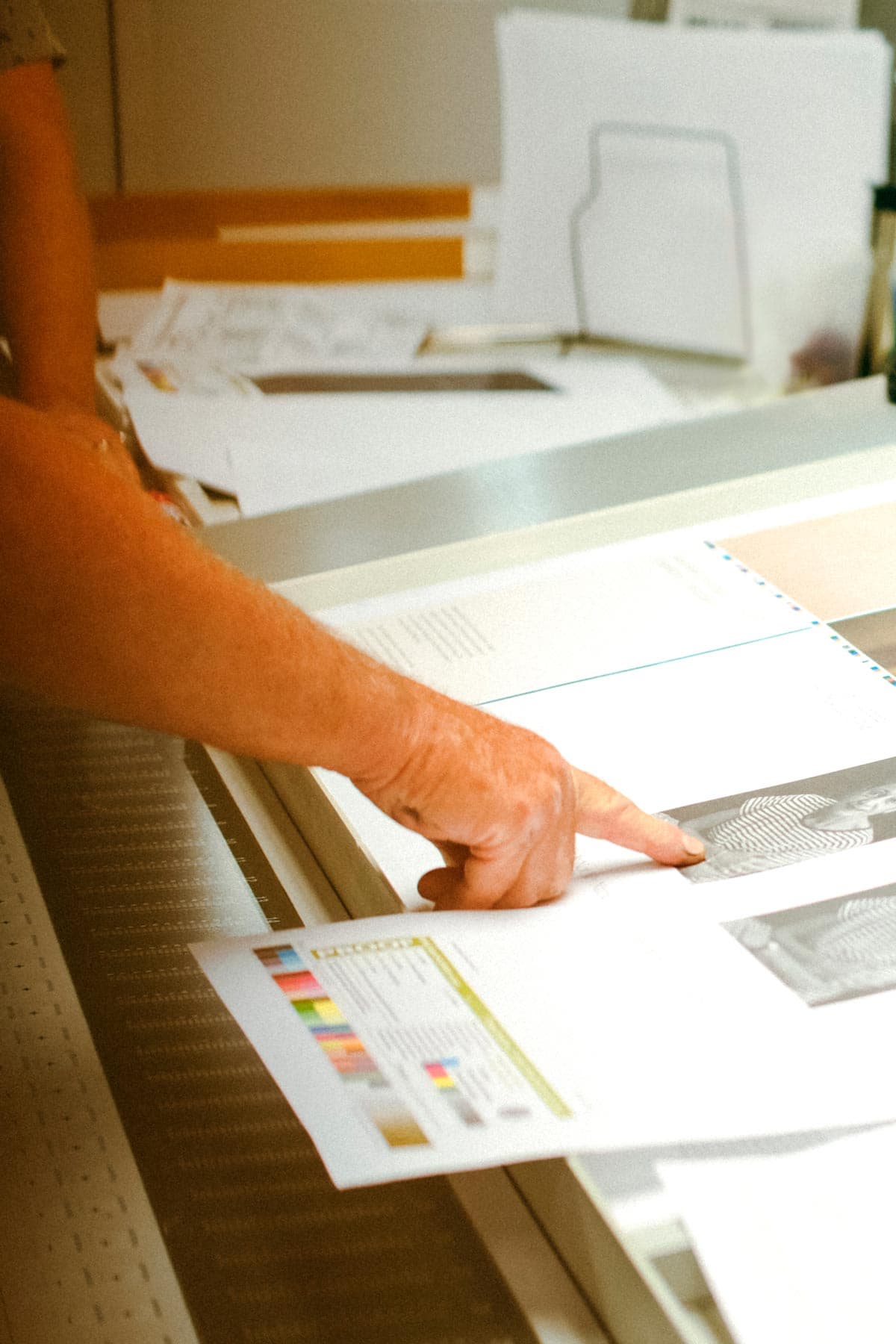
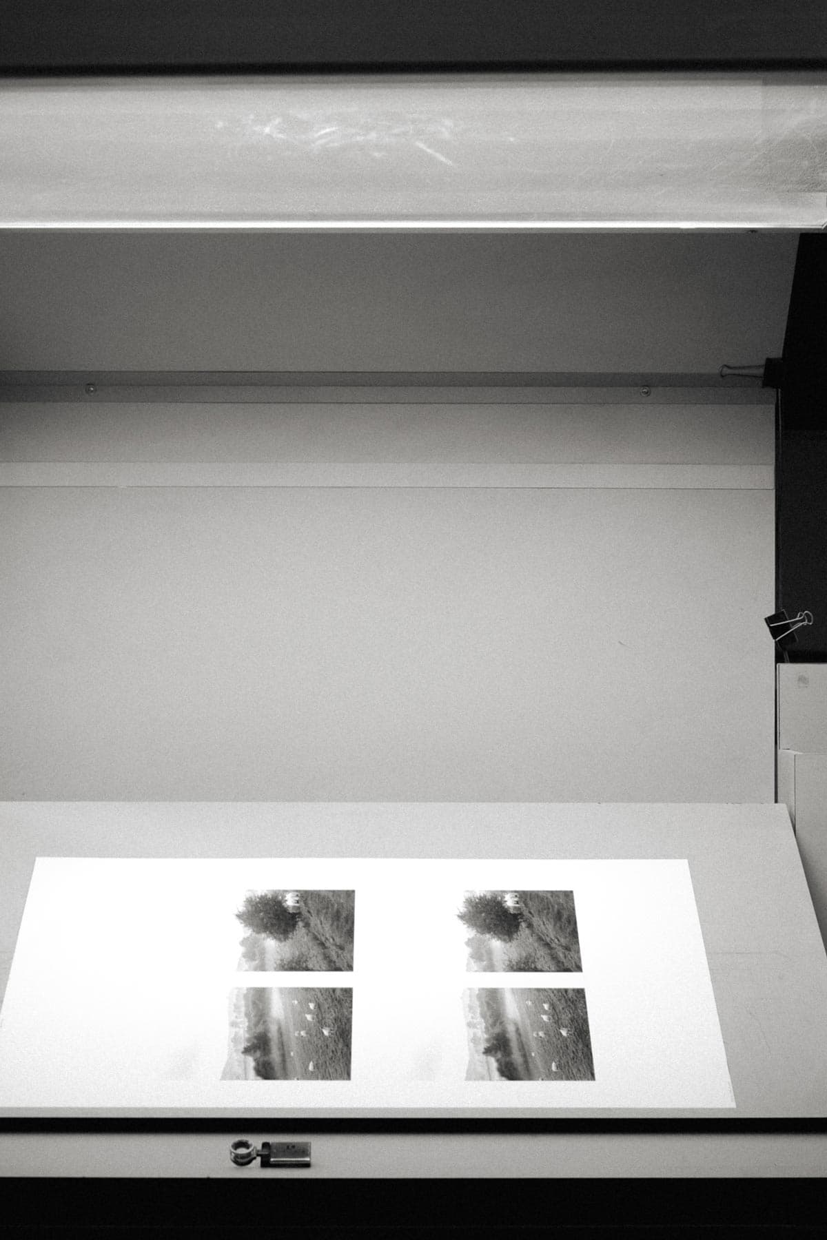
The impact of the pandemic gave way to a rise in podcasts that focused on mindfulness, meditation and inner healing. Writer Sarah James launched the Clerestory podcast and online magazine to “provide a space for writers, artists, and activists to explore personal, spiritual, and social dimensions of human flourishing” during a very uncertain time in the world. After gaining a faithful audience of readers and listeners, Sarah came to us to explore the possibilities of publishing the inaugural printed volume for Clerestory—a way to bring the online stories and poetry of contributing writers into a tangible, physical form.


Design

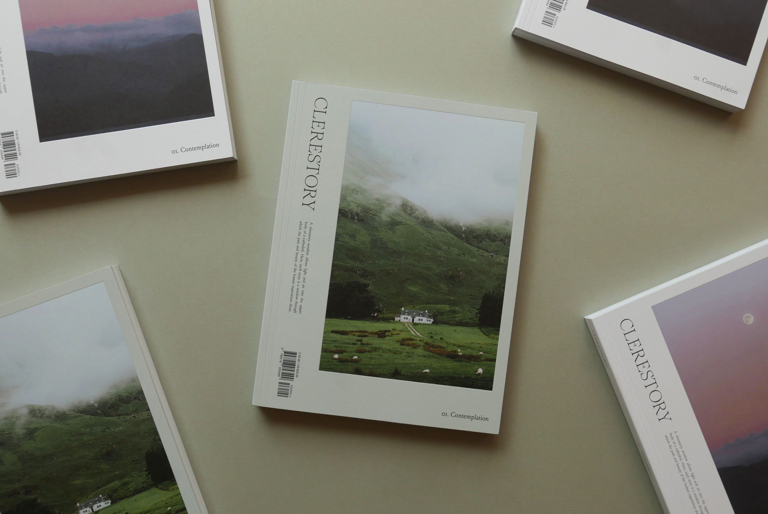
As with all of our design work, we began by trying to listen and understand the Clerestory voice and personality—much of it expressed through Sarah’s own personality as well as the voice of her contributors. These observations helped inform our approach to the layout and also the typography choice for the magazine. We settled upon Louize Text as the body text—a contemporary serif with warm and approachable characteristics and historical influences.

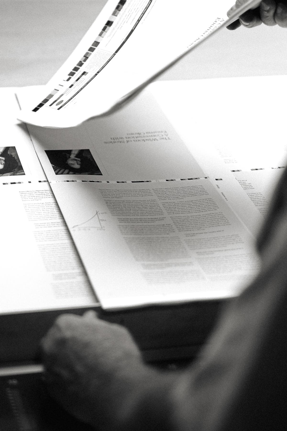
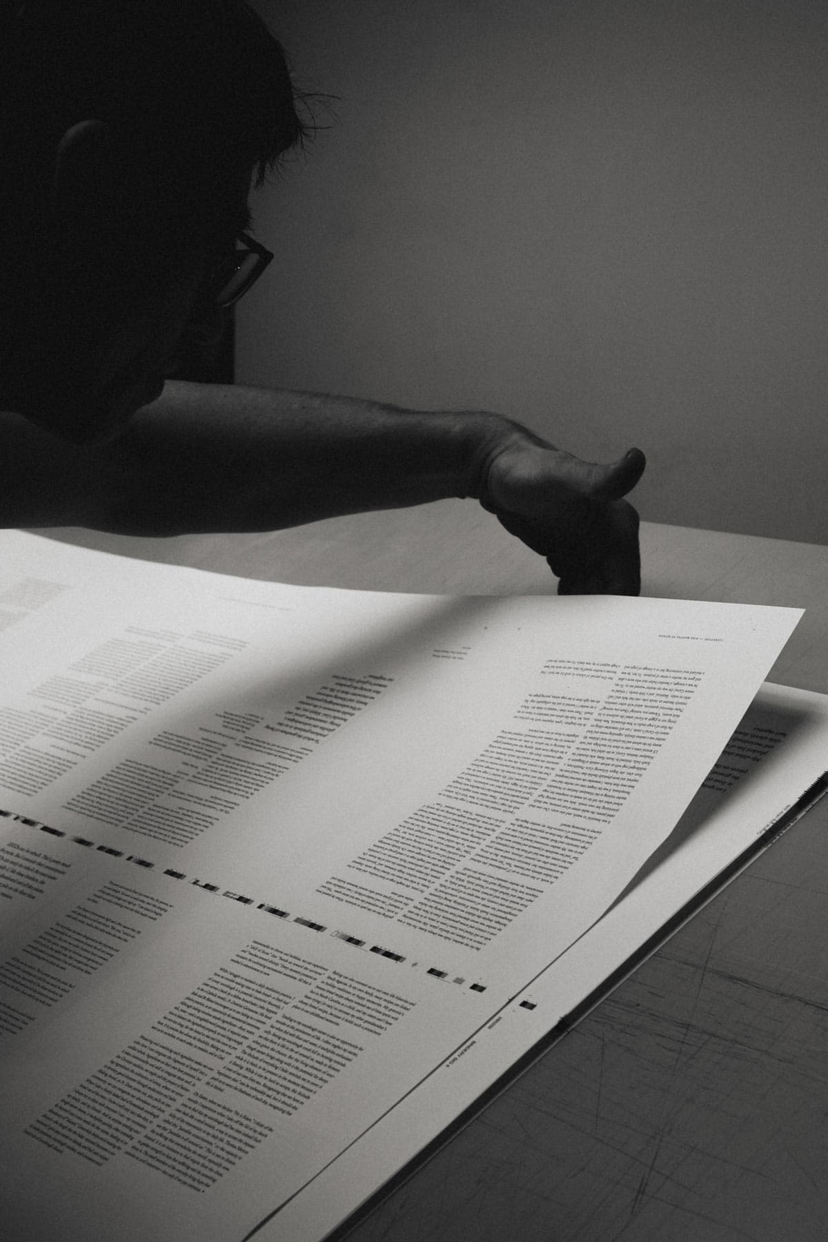
The main challenge of this project was finding a grid structure that would comfortably handle various lengths and type of content, from essays to interviews, poetry to photo stories. We settled on an eight column grid that allowed us to have both the flexibility to handle the various content types and also the structure to offer a visual consistency.

Earlier layout tests with an eight column grid.

Printing Process

In late August, we visited Hemlock Printers for a press check on behalf of Clerestory Magazine. After working closely on this publication for eight months, it was truly rewarding to see it finally translate from screen to print. It has been awhile since we stepped on the printing floor but seeing all the work that goes into making a printed book always makes us appreciate the process even more. Many of the staff who managed the printing of our project have been at Hemlock or in the print industry for more than 20+ years. A special thanks to our account manager Paul Verrall who was instrumental to the project from start to finish.

The magazine was printed on Domtar Lynx smooth uncoated paper and bound using a layflat binding method to allow the magazine to open flat.

1
2
  • 1

    First test runs for the two versions of the magazine cover

  • 2

    Hemlock print technicians adjusting the black tones

Magazine Design

Our final design for volume 1 of Clerestory Magazine included two cover options in white and in mint, with alternate cover photos shot by Daniel Casson. The magazine is typeset in three typefaces with Romie as the font for titles to continue Clerestory’s brand identity and Louize for the body text. Helvetica bold was used for subheadings.

As a reflection of Clerestory’s online content, the magazine is divided into four categories—essays, interviews, photo stories, and poems. Each section begins with a section title spread using the Clerestory blue as the background and acts as moment of pause for the reader.

Given the array of content lengths and varying number of photos per entry, we established two opening spread layouts which allowed us to adapt the layout of the content accordingly.

We used an eight column grid that afforded us the flexibility of laying out long form content, pull out quotes, and reference notes—all in a cohesive approach.

As a finishing touch, the cover photo area was debossed to give a sense of framing. We felt this effect would be a nice reference to the meaning of the word clerestory: “a window that allows light and air into the upper body of a cathedral”.

Flatplan for the inaugural issue of Clerestory Magazine