In the past three years, we had the opportunity to work with Jeremy Jude Lee on several projects. When he reached out to refresh his photography brand and portfolio website, we were more than excited to take on the opportunity. Jeremy is a household name in Vancouver when it comes to photographers. With each project, he would not only bring his incredible eye but also his uplifting enthusiasm and spirit to set. For this identity project, we wanted to make sure we did his work and his personality justice, all the while setting the stage for his continual growth in the industry.
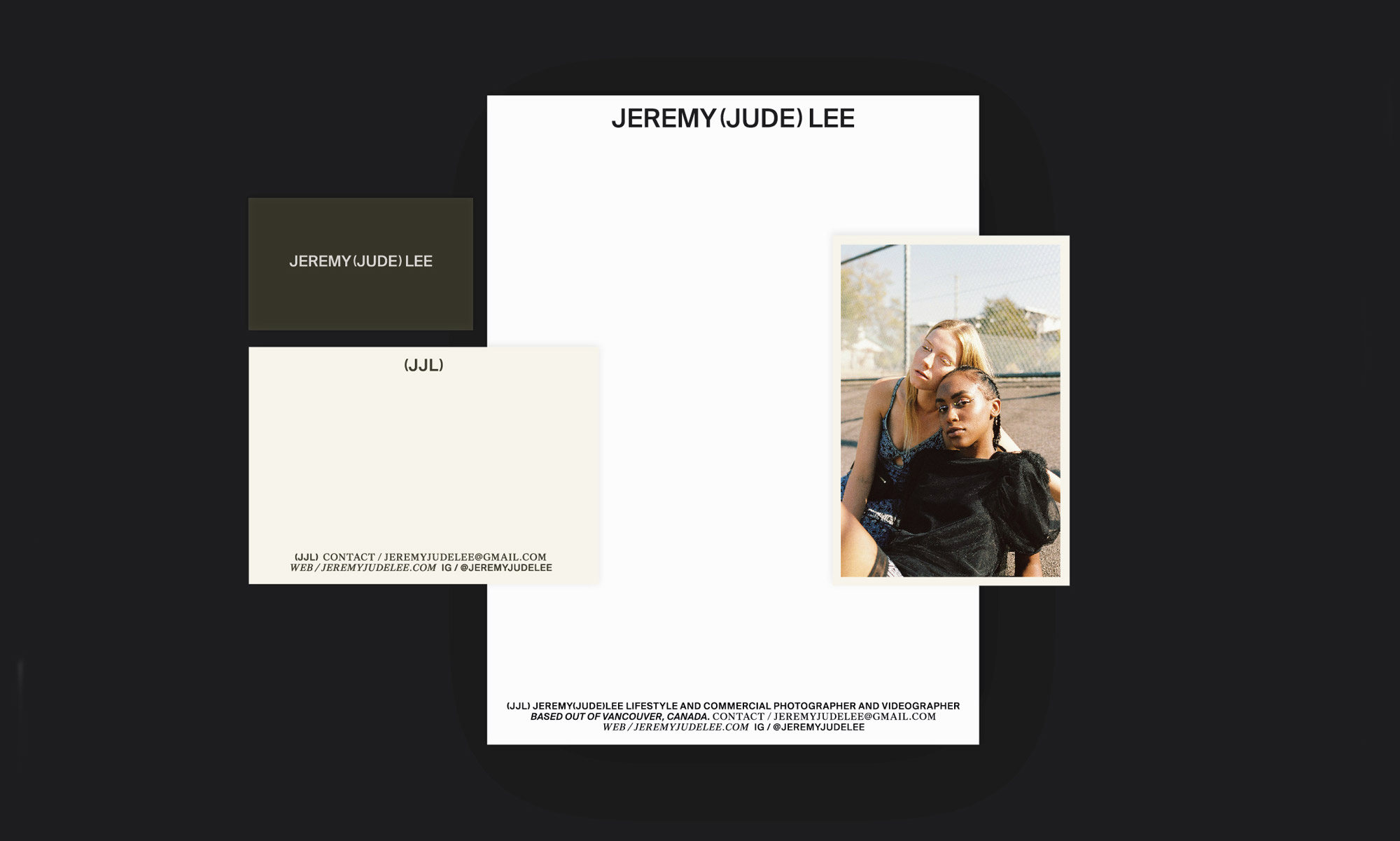
Branding
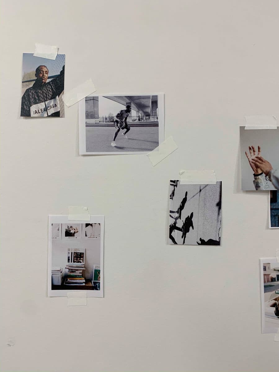
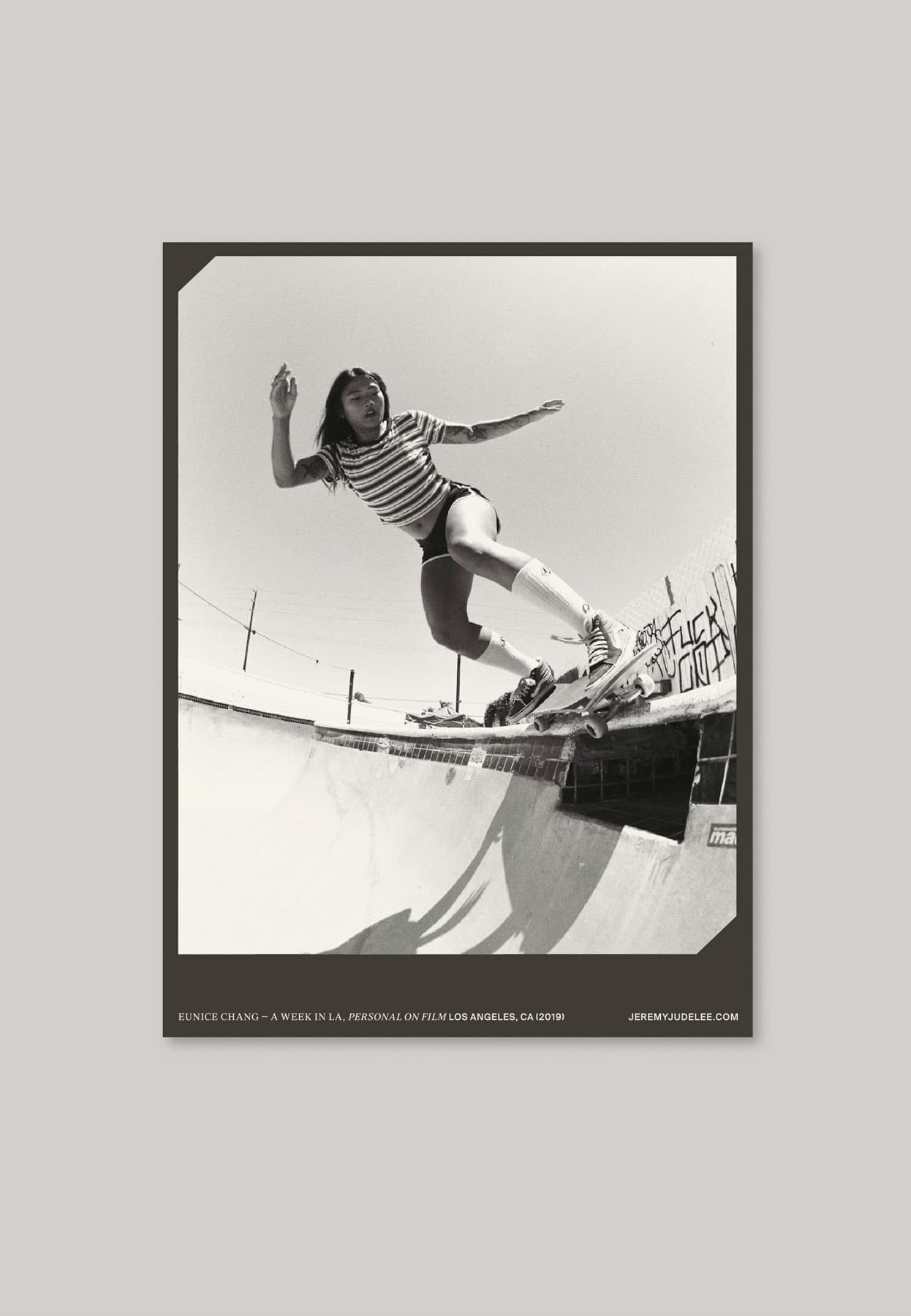
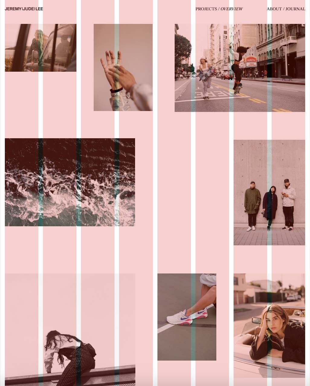
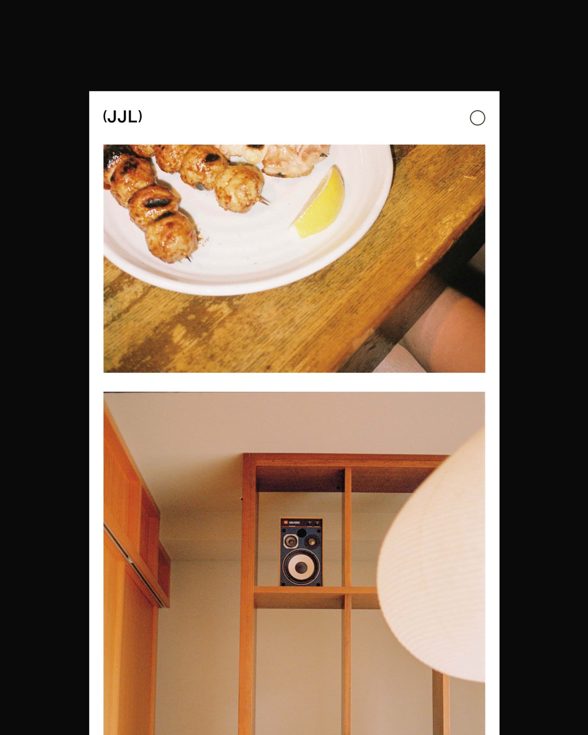
With such a vast amount and variety of work, one of the main goals for the project was to curate his existing work to better capture Jeremy’s photography style and attract a clientele with a similar vision.
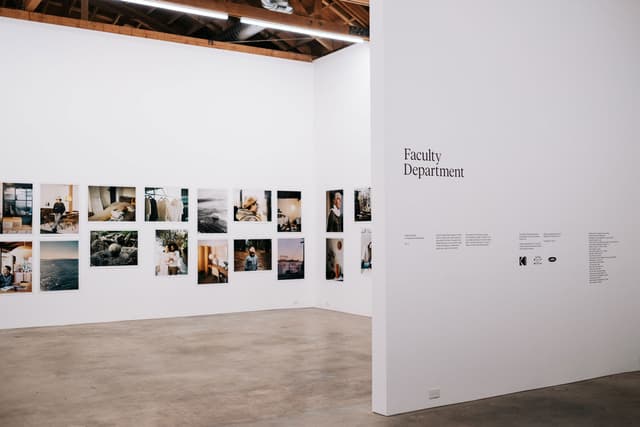
As we began to reorganize his work, we found the theme of an art gallery to be a fitting concept for Jeremy’s brand direction. From the act of curation, to the consistency in type treatment, we applied these visual cues to Jeremy’s brand in hopes of elevating his work to the world of high art.
Having worked with Jeremy on multiple shoots, we also recognized his infectious energy and ability to connect with others as unique aspects of his identity. Jeremy’s personable qualities allows him to capture more intimate moments with his subjects—framing all of this through his lens.
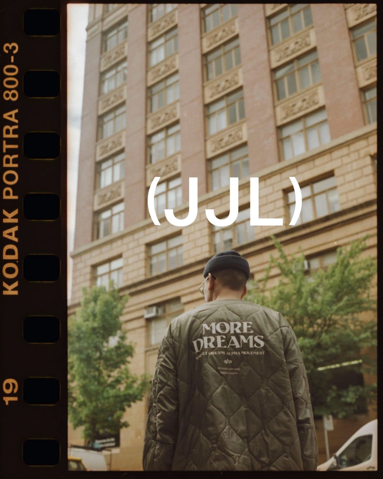
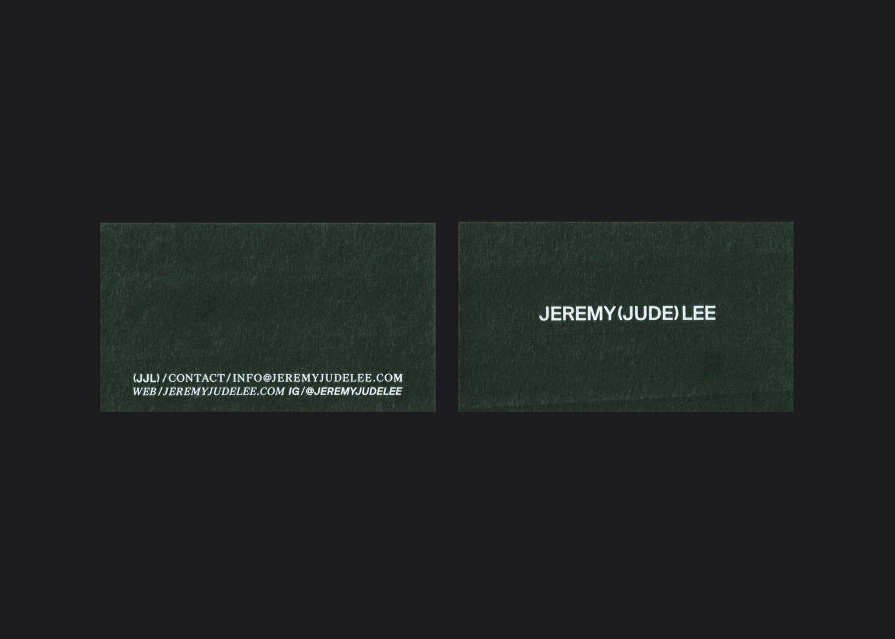
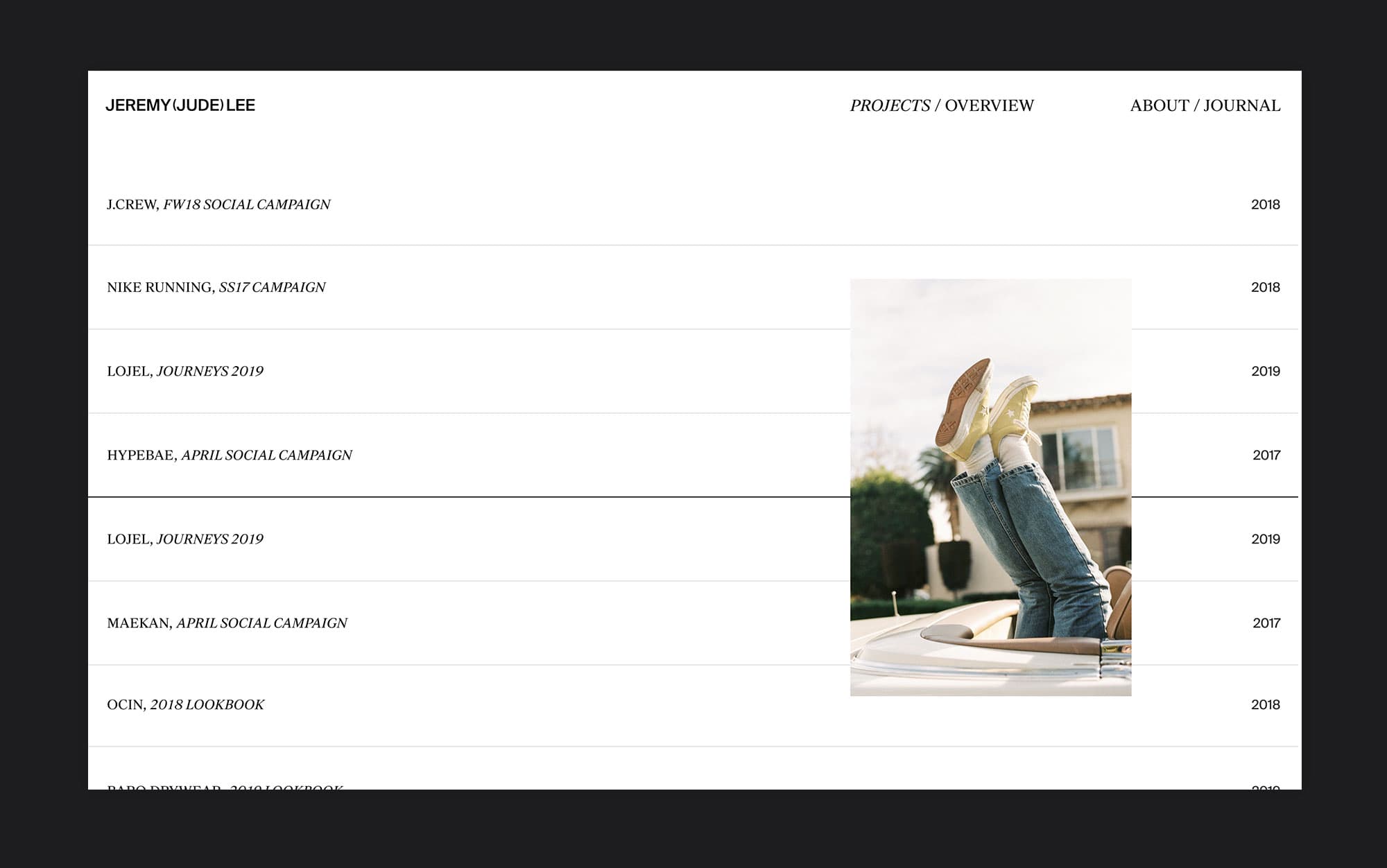
These focus points brought our attention to Jeremy’s middle name in his brand. We recognize there is something intimate and personal about a middle name. Jeremy’s middle name, Jude, stands out to us and is a unique part of his identity. In our execution of the concept, we utilize parentheses as a way to highlight the middle name. Similar to the function of a camera lens, the parentheses in our concept act as a way of focusing or framing something of importance.
For the brand system and type treatment, we took inspiration from art galleries, museums, and streetwear culture. We strived to bring the same amount of prominence to Jeremy’s existing work, while creating a tone for the future and potential work to come. We choose a sans serif and serif type pairing to highlight this balance between sophistication and authenticity. Tight margins were used to create a refined appearance and visual approach that displays confidence and excellence.