Since 2014, we have been working with travelware brand Lojel on revitalizing their brand imagery and the production of their yearly campaigns. In 2017, Lojel approached us with the task to rebrand their 28-year company. This was an opportunity to work on something that is very personal to us—travel. From the people we meet to the creativity we seek, travelling has always been a huge source of inspiration for our studio. Lojel wanted to create a new brand identity to showcase the direction for the company.
Process
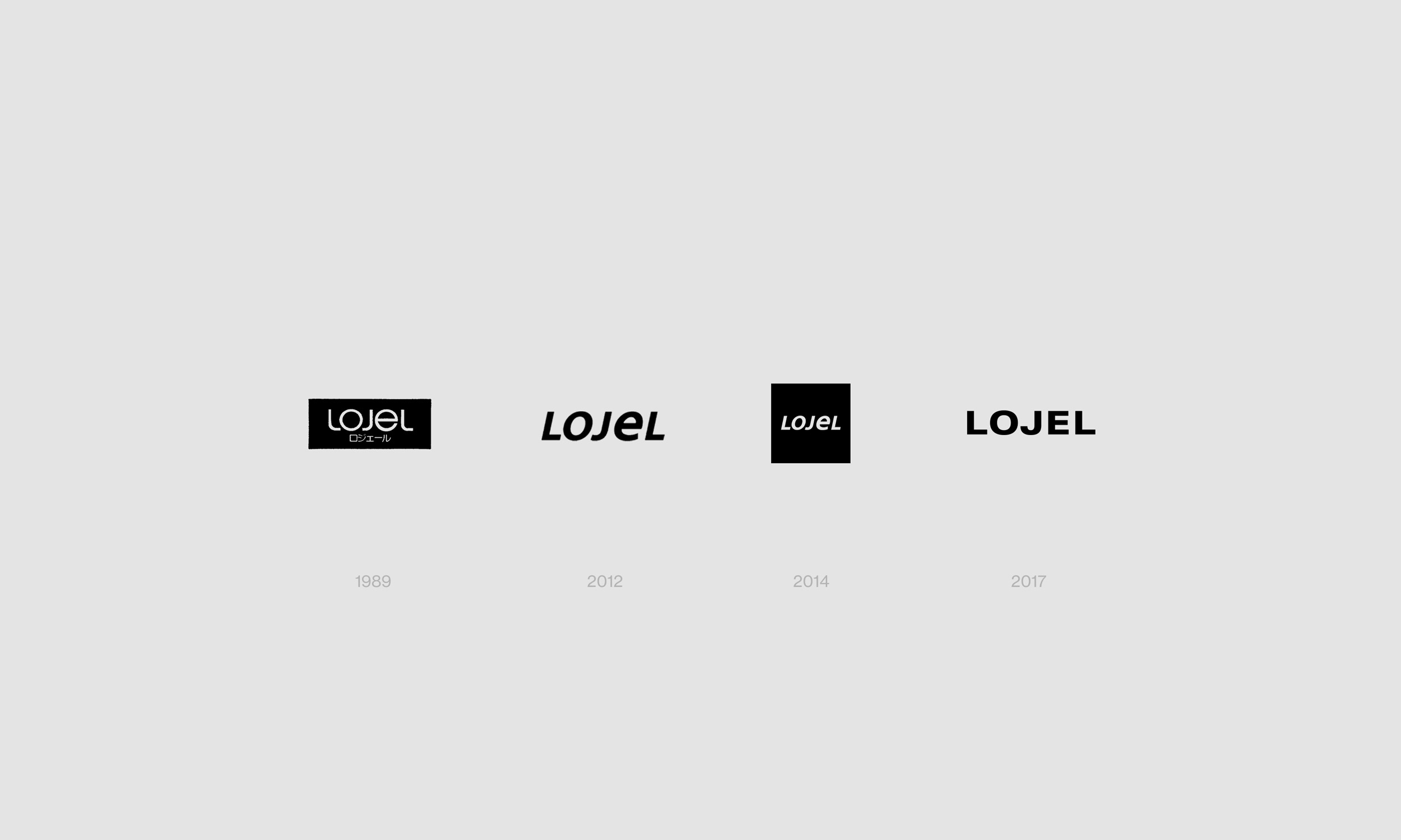
Having worked with the Lojel team on their brand collateral in the past years, we understood the brand applications that would need to be considered when designing the new brand identity. In previous years, the Lojel brand had relied heavily on their signature green as way of building brand distinction amongst their competitors. Yet, as the company began to explore different colours for their products, pairing some colours with the green proved to be a challenge. At the same time, the Lojel team had been relying heavily on the square format of their logo as the square was visually more recognizable. Yet, the square format would provide difficulties when used in small spaces both in print and online.
Taking these issues into account, we looked to create a new brand identity for Lojel that provided application flexibility and a visual direction that could withstand the test of time.
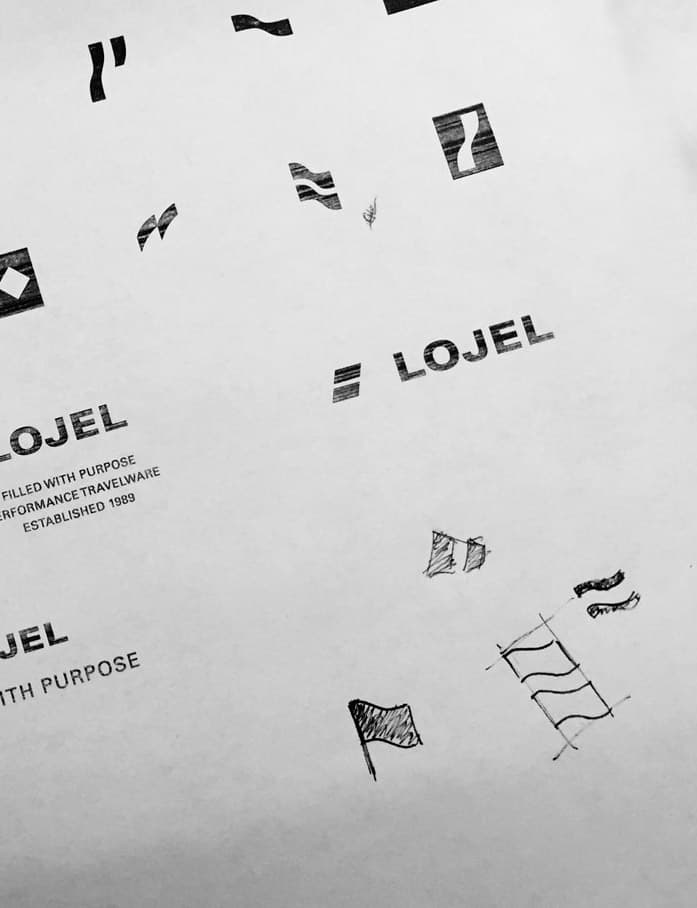
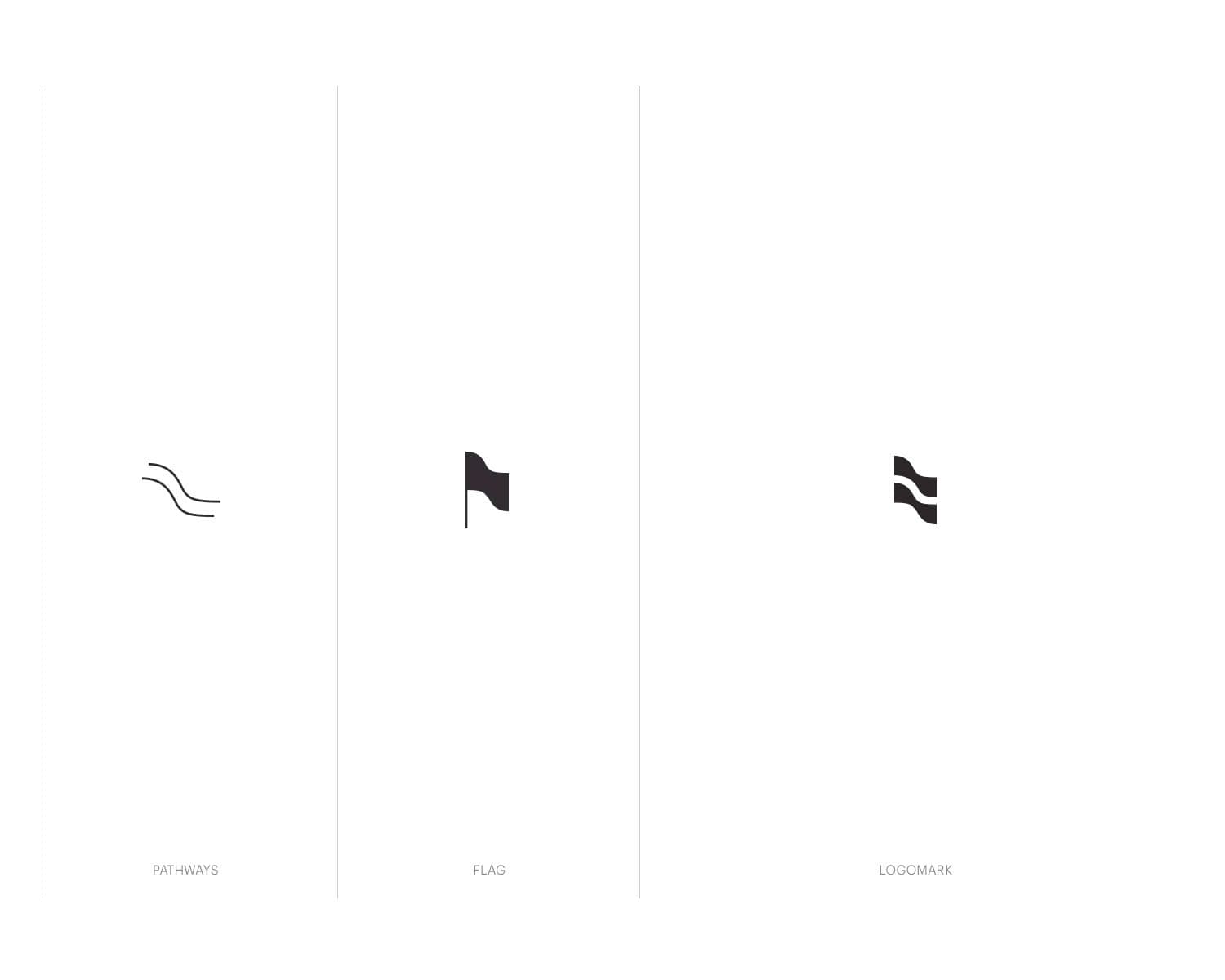
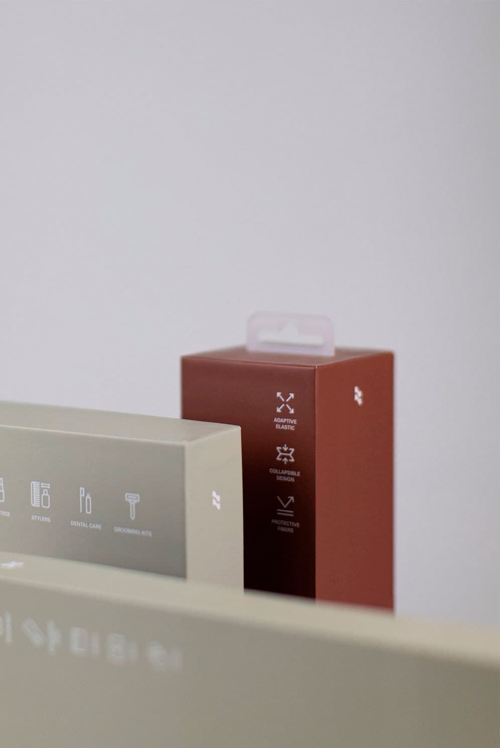
One of the main brand elements we collectively agreed was needed for the brand was the creation of a logo mark. We wanted to design a mark that was reduced to simplified shapes, allowing it to fit in small surface areas like a zipper tab and had the weight to stand out when placed on top of a photo. Creating such a mark can often prove to be challenging since we wanted to achieve a mark that was ultra-simplified, while still being unique and iconic to Lojel.
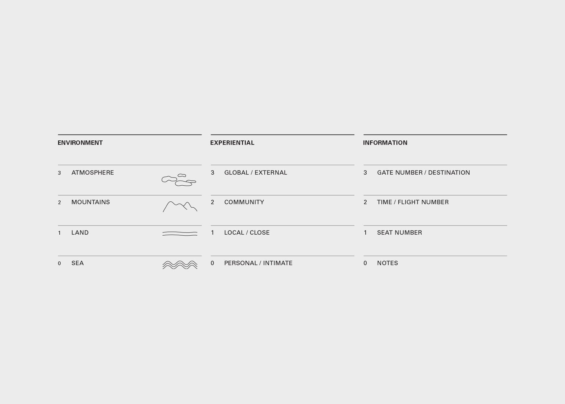
During our exploration, we were looking into the idea of a journey, and drew our inspiration from the iconography found in road maps. Our final iteration of the logomark combines the symbols of a pathway and a flag to create Lojel’s “journey” logo mark. We liked the visual of a pathway to represent a journey, and the flag as a mark of arrival. These images resonated with our team in terms of what we were trying to convey in the spirit of Lojel’s brand.