Andrea McLean Studio Inc.

Brand Identity

2023

  • Branding,

  • Identity

We have been admirers of intern architect and interior designer Andrea McLean’s work for quite a number of years and had discussed working together on several occasions. This past year, we finally had the opportunity to work together on her studio’s brand identity.

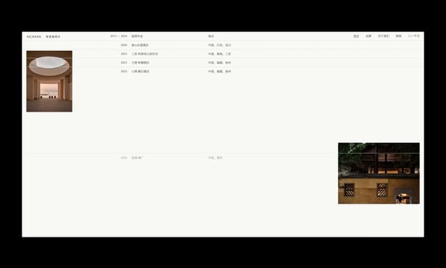
Having worked in the industry for numerous years, Andrea’s work and name is well recognized locally and continues to build traction globally. However, despite trying on various occasions to establish her studio’s brand identity, her past attempts failed to truly reflect her design vision. Andrea tasked us to help create her brand identity and later build out a new online portfolio to showcase her body of work.

From early conversations, we established Andrea’s work to be observant, intentional, empathetic, essential and adaptive. These are the qualities we strived to visualize through the new identity and brand typography. So much of design is often drawn from one’s life experience, cultural influences, sensibilities and personality. As Andrea shared with us her background and history, we clearly saw how her life journey and years living in Japan have definitely influenced her design approach today.

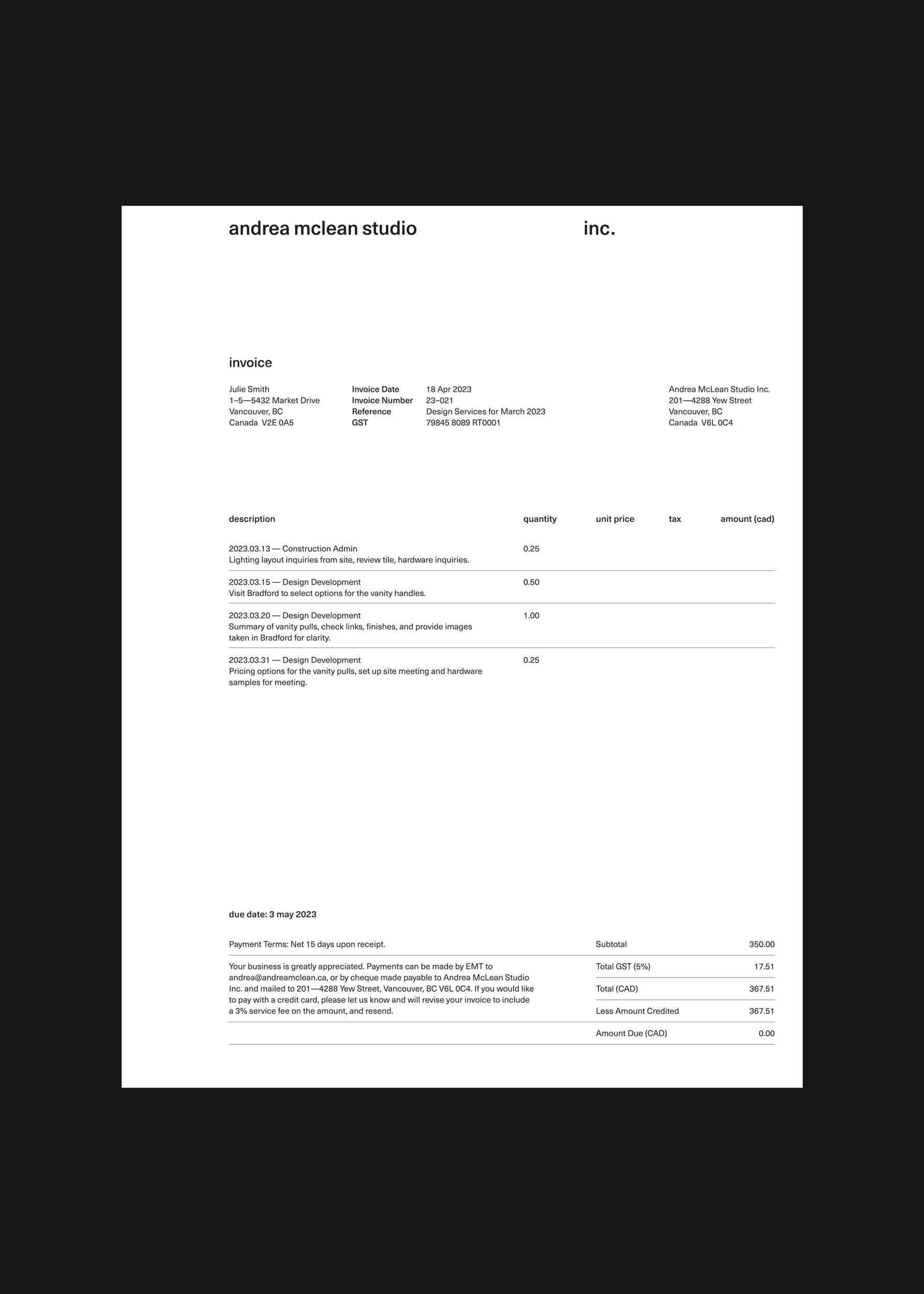
As we approached the design of Andrea’s brand identity, we centred much of our attention to the type choice for her brand. To us, Unica provided the right pragmatic yet approachable tone of voice that reflected Andrea’s personality and design sensibilities. As a neo-grotesque sans serif designed in the late 70’s, Unica carries a familiar and nostalgic appearance that is often hard to articulate. We appreciate this quality about Unica, as it makes Andrea’s brand identity appear as though it was established 20 years ago while still being relevant today.

Taking inspiration from how Andrea approaches each project in first observing and responding to a site, we utilized a grid system that provided structure and modularity, allowing her brand identity to be adaptive to any situation. Andrea’s final wordmark includes both a horizontal version as well as a stacked version giving her flexibility to use either versions depending on which one would fit the situation best.

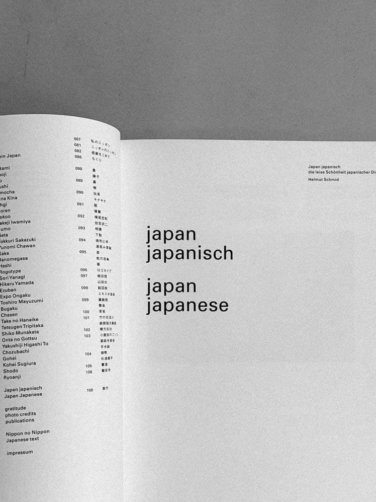
A deliberate effort was made to treat much of her brand collateral and application in lowercase. This approach was greatly influenced by books and design examples from the late Austrian designer Helmut Schmid, who similarly spent a significant number of years living and working in Japan (Osaka).