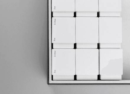
We were a few weeks into the branding process for New York based fashion photographer, Justin Chung’s personal identity when he subsequently shifted our attention to a much larger endeavour he had in mind. Enter Faculty Department. Justin began sharing with us the stories of his studio visits and moments with artists, furniture makers and people he admired. His photos and recollections of his experience led us to feel as though we were present and knew these individuals personally.
Faculty Department Vol. 1
Publication Design
2014
Art Direction,
Branding,
Identity,
Print


One of the most important components in our process was to find the most fitting typeface for the publication. Tiempos was chosen for both the publication text and wordmark.


Paper stock and linen cover selections for Volume 1
Discovery/Process
With Volume 1 being the inaugural issue, it was important for us to establish the brand identity and world of Faculty Department. Our studio began to explore the personality and tone of voice for the publication through a series of moodboards and keywords. Through numerous conversations with Justin, there was an unmistakable academic aspect to the book. Having previously been in medical studies before becoming a photographer, Justin continuing referred to each individual as part of his “faculty”—the teachers and mentors he learned from. Faculty Department was meant to be a sort of ode to his professors—a way of applying the same research process and academic due diligence he had learned, now towards the form of a photography book.
With hundreds of photos taken, one of the main tasks for our team was to select, organize and arrange an order for the story to be told effectively. Working alongside Justin, we collaboratively narrowed down our selection to the strongest selects to keep each story tight and focused.
Turning our attention to the materiality of the book, we felt that Munken Lynx was the perfect paper stock for this publication. The uncoated smooth yet tactile surface and natural white shade gave the images a warmth and natural aesthetic.
Justin visited Vancouver to work with us in our studio for a week in order to finalize each story. After the design file was sent to the print shop, Justin and our team decided it was worthwhile to attend the press check in Iceland where Volume 1 would be printed.


Type tests, moodboards and wordmark explorations

Design
In selecting the right typeface for Faculty Department, we wanted to find one that looked sincere yet academic in appearance. It was important to us that the look of the typeface would seamlessly reflect the same tone of voice of the writing. We decided to go forward with Tiempos, a contemporary serif designed by Kris Sowersby (Klim Type Foundry). Having references to Times New Romans, this provided a sense of familiarity to the text for most readers. As we approached the design of the book layout, we aimed to create a layout that felt natural and honest in its presentation.
A number of book dimensions were tested for the project. We wanted a book size that was comfortable to hold and easy to flip through. The final size was 7.5″ x 9.5″ with 265 pages. This size was chosen as it felt similar to the size of most textbooks—an added reference to academia.
A 2 column layout was used for this publication. To provide optimum readability, allowing each line of text to be about 12 words.
Afterwards
The journey in making this project was perhaps as enjoyable as seeing the final product. Our team was able to see and experience every step of the process from developing the brand to seeing the print production first hand in Iceland, to even the fulfillment process. Faculty Department Volume 1 was the first long form publication we produced since starting our studio, hence we learned invaluable lessons from the experience and this project holds a special place in our hearts.


