Faculty Department Vol. 2

Publication

2019

  • Art Direction,

  • Print

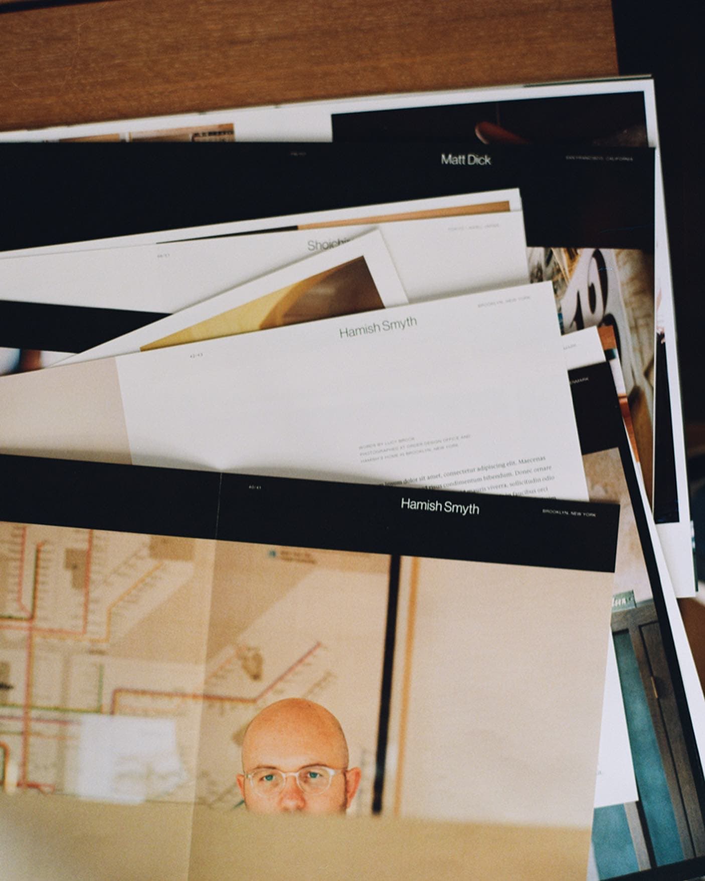
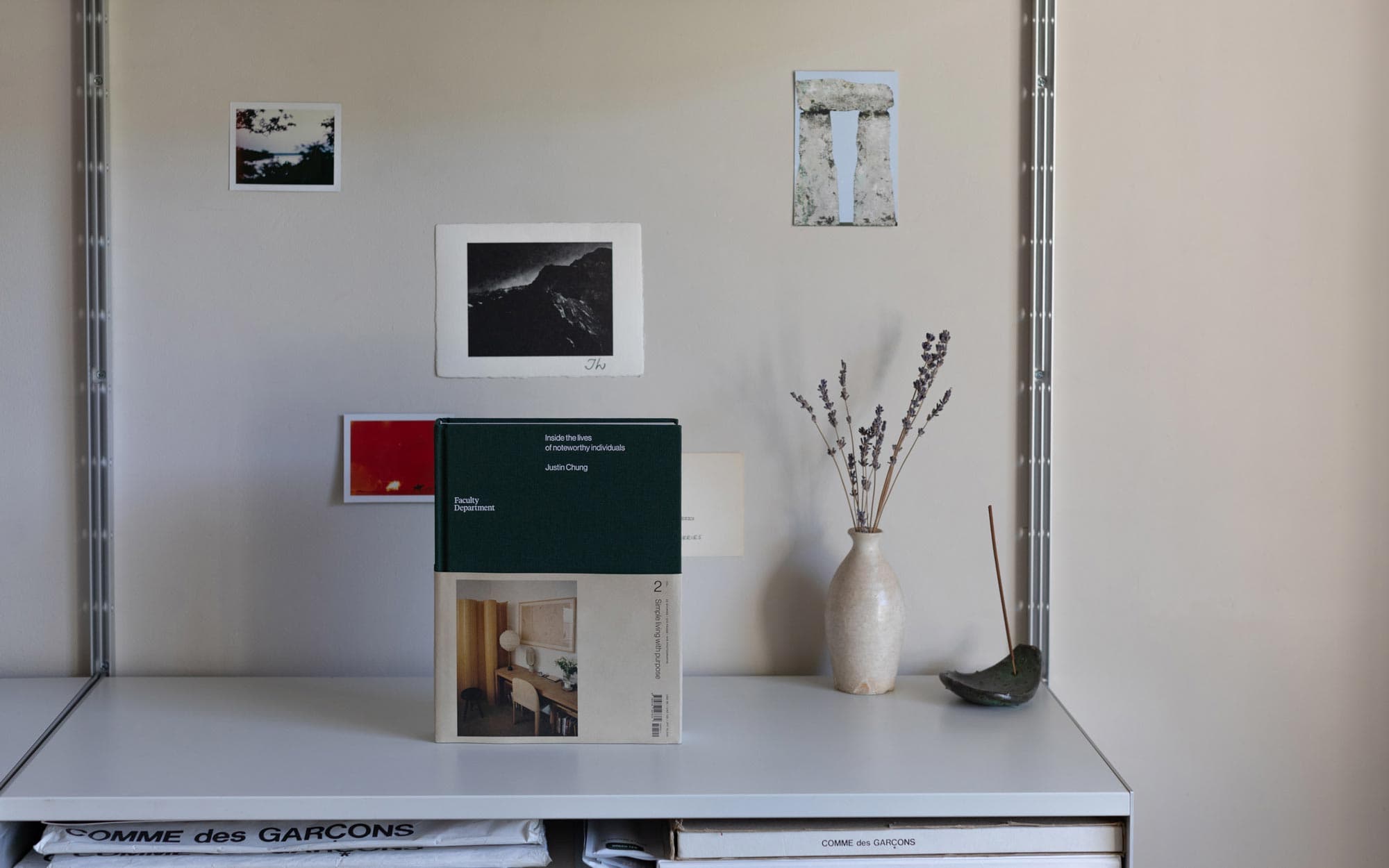
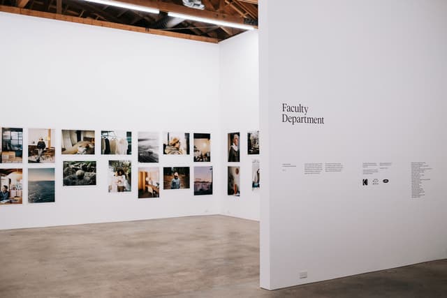
In 2014, we worked with photographer, Justin Chung on the inaugural volume of Faculty Department and released the self published title around the world. It was significant turning point for our then two year old studio, as we got to showcase our work beyond our city and we were very encouraged by the positive response.

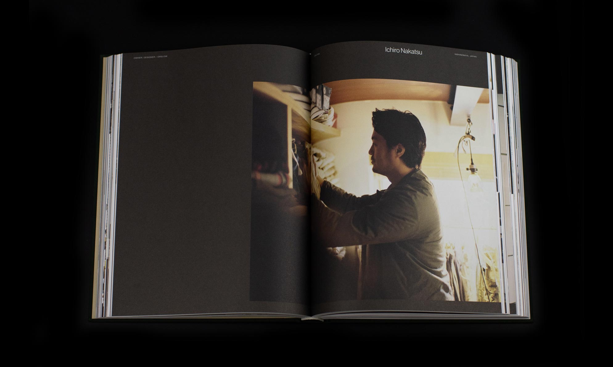
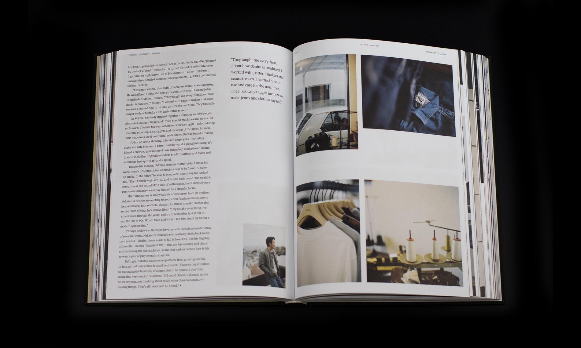
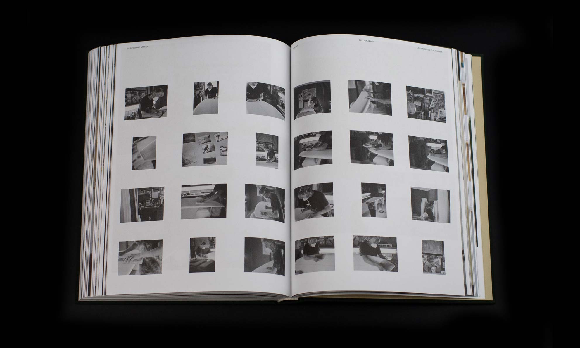
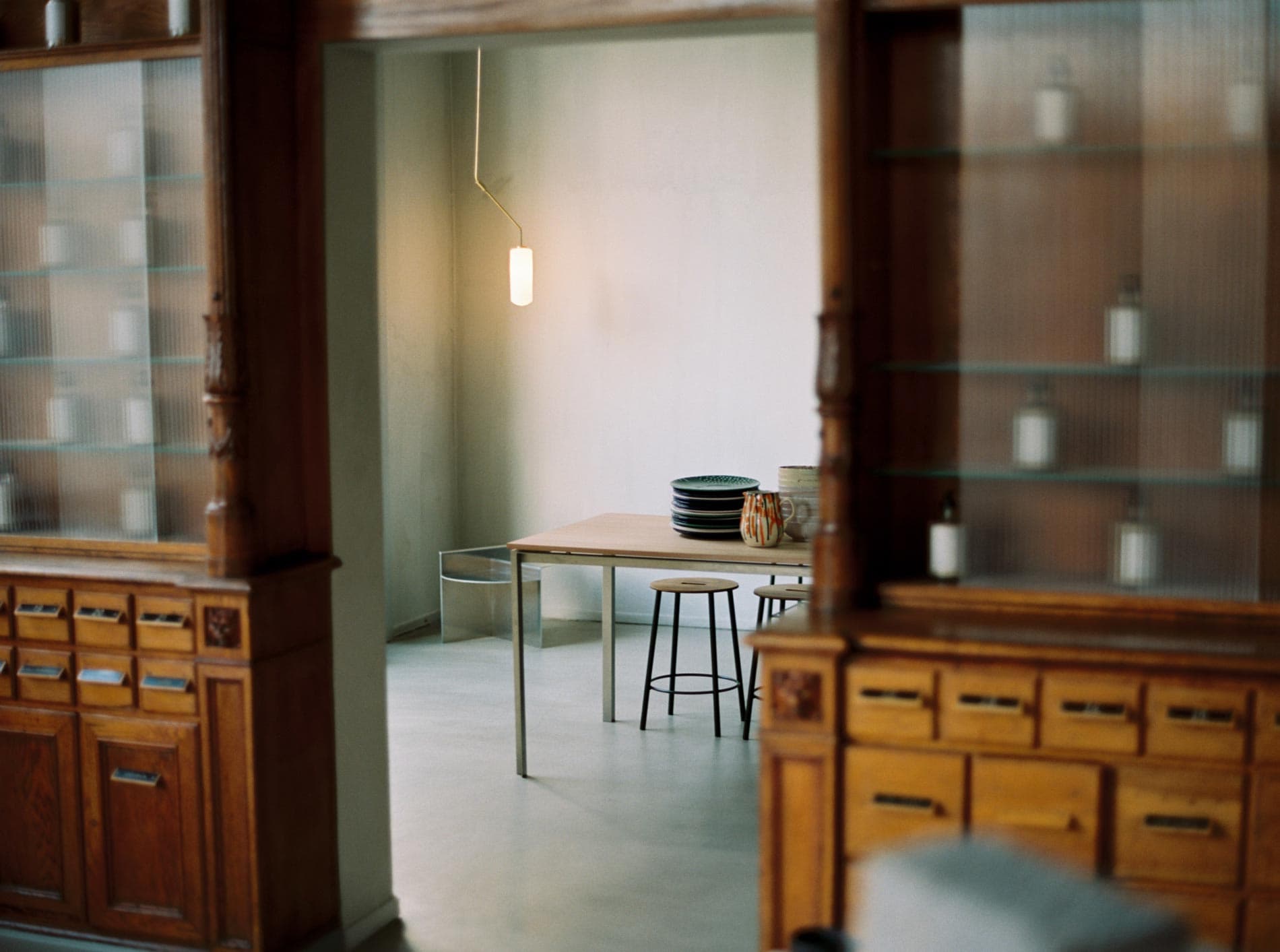
Since the 2014 release, Justin has continued to document stories of noteworthy individuals around the world and also in California, his new home since making the move westward. Within these past five years, both Justin and our team have gone through life changes that have shaped the theme for volume two of Faculty Department—“simple living with purpose”.

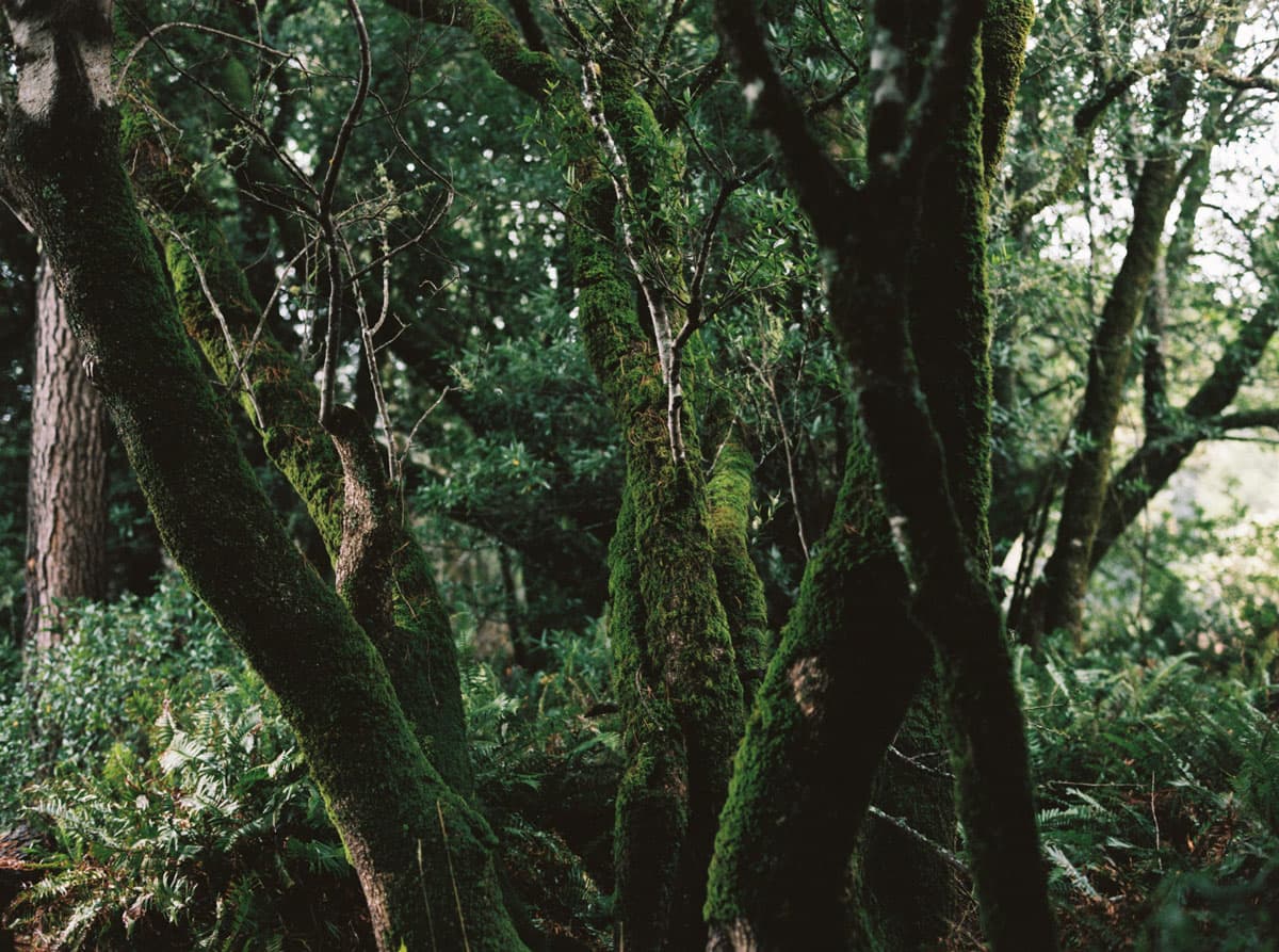
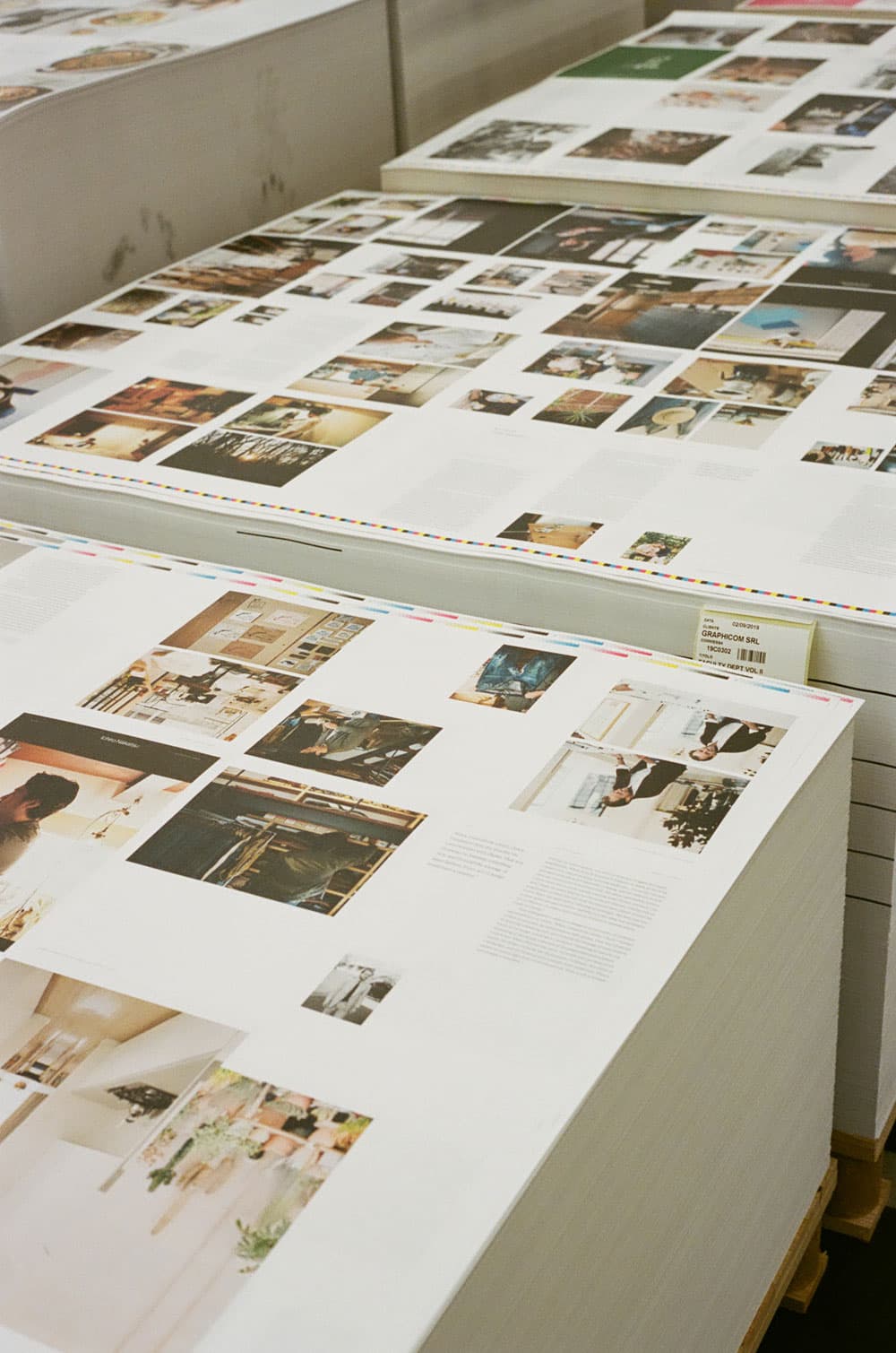
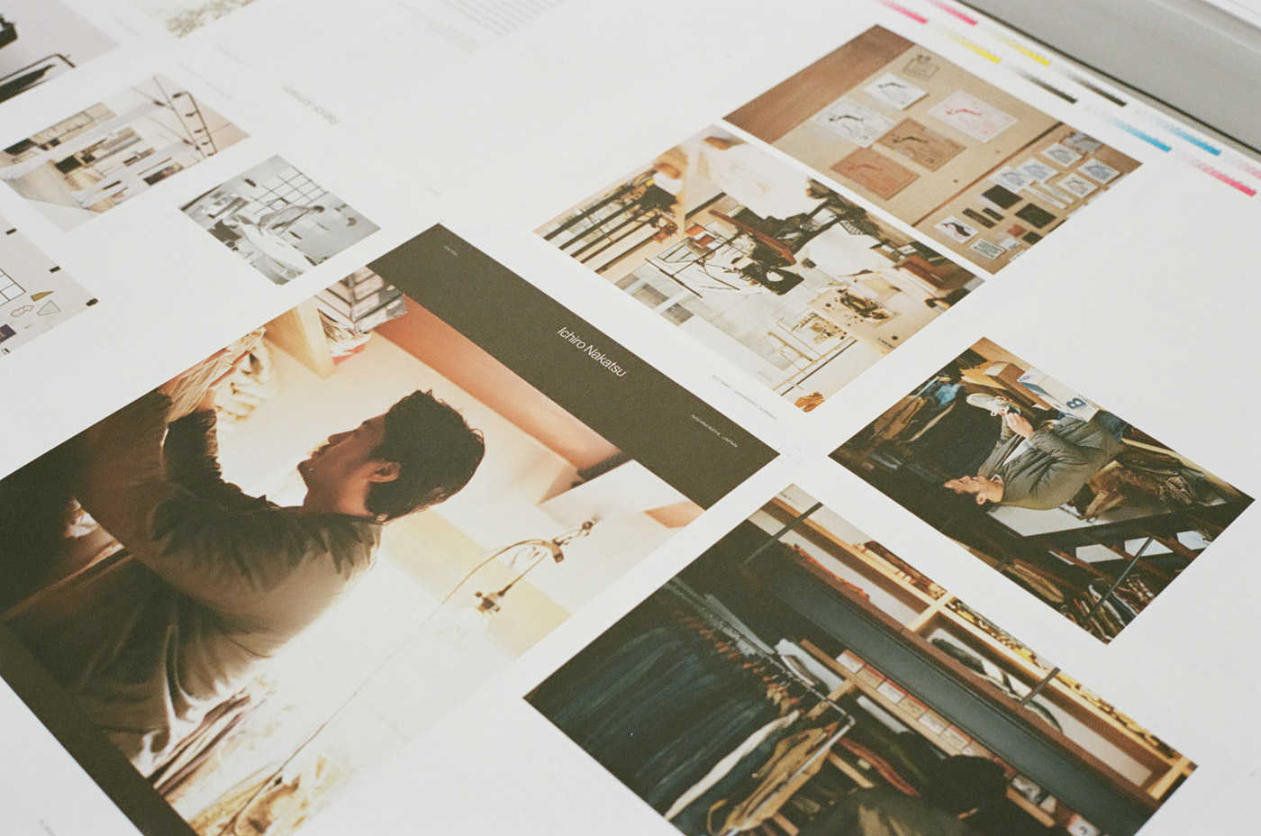
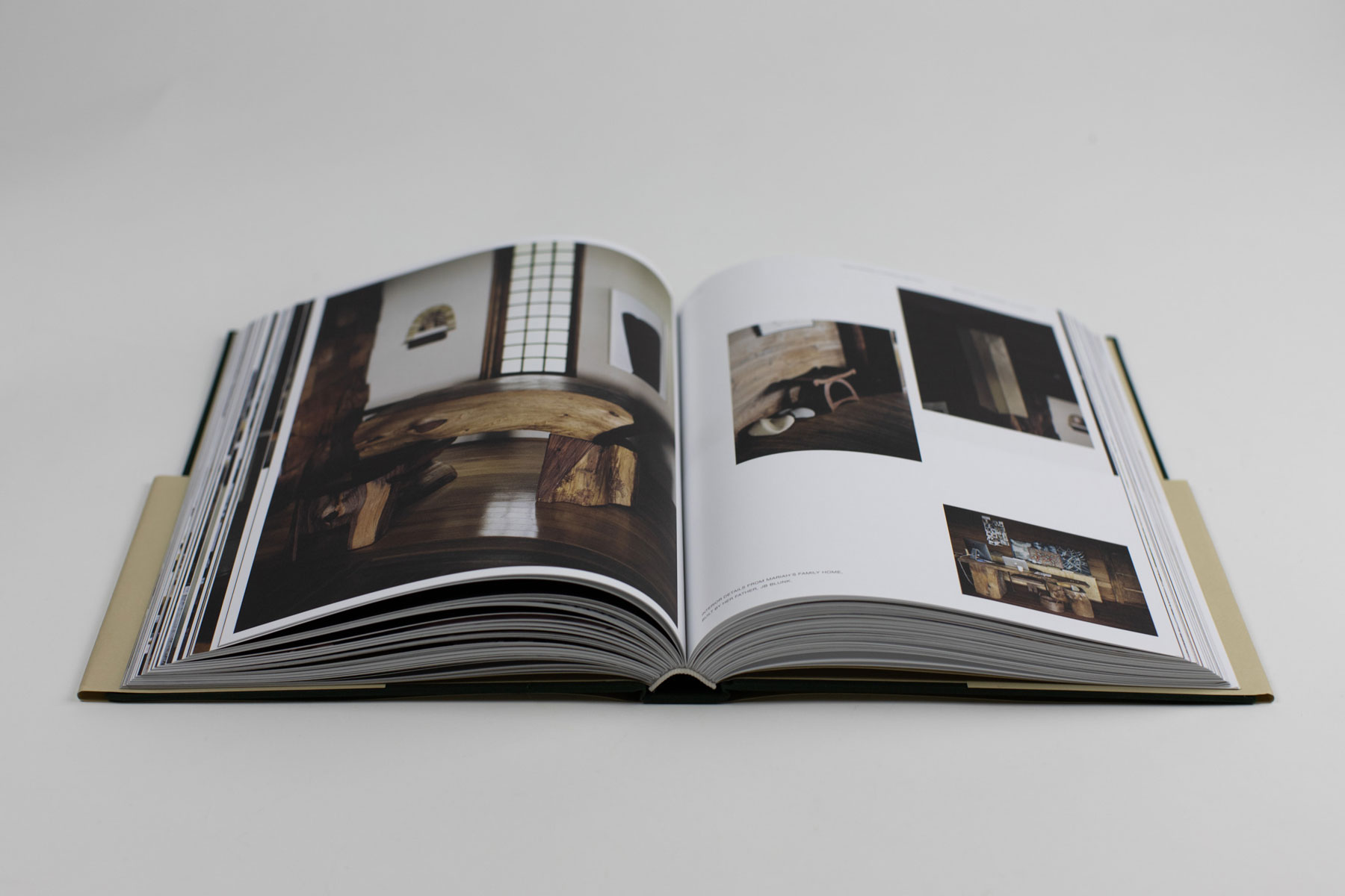
For Faculty Department Vol. 2, we decided to print the publication in Verona, Italy. The proofing process proved to be a challenge due to the time difference, yet looking back, it was certainly a worthwhile experience. Upon arriving to their production house, we join our print rep Roberto on the printing floor to examine the first press sheets off the press. The book was printed on Munken Lynx, 120 gsm and wrapped with Wilbalin Natural 502 Fawn end sheets. For the cover linen cloth, we used the 4186 Green swatch from Brilliantia®—a colour that was inspired by the moss green trees from Mariah Nielson’s story in Inverness, California.

Moss trees in Inverness, California. The green colour from this photo became the inspiration for the cover cloth of Volume 2.

1
2
  • 1

    Printed sheets off the press, set to dry

  • 2

    Colour checking at Graphicom SRL

Design

As we began to explore ideas for volume two, we knew we had wanted this new volume to be a clear maturation from volume one. It was important to Justin that more photographs would be included for each story, giving the reader a fuller picture of the subject and their way of life. We set up a grid system that allowed us to create approximately 12–13 layout variations. By alternating between the layout sets, we able to diversify the content display and make each spread appear uniquely designed for the content.

In addition to the layouts, we also introduced two sans serif typefaces to the publication to further develop the Faculty Department brand. Neue Haas Grotesk was used for the book cover and display text for each subject’s name while an expanded weight of Helvetica Neue was used for the small titling and captions. We chose these two typefaces as they added to the industrial, old textbook look and feel that we were striving for. Tiempos Text remained as the body text for the book to continue the visual tone of voice for Faculty Department.

By increasing the page count from 265 to 372, volume two was certainly a much larger undertaking that required extensive iterating and review. Ultimately, we wanted to create this publication as a great source of inspiration to creative individuals and entrepreneurs as a document that can be referenced for years to come.

Opening spread for Ichiro Nakatsu (Orslow)

Inner spread for Ichiro Nakatsu (Orslow)

Pages 286–287, Guy Okazaki (Surfboard Maker)

Nasu, Japan (from story of Shoichiro Aiba, LIFE Restaurant) / Photo: Justin Chung

Pages 320–321, Rosa Park & Rich Stapleton (Cereal Magazine)

Index: publication timeline