Harken Coffee

Brand Identity

2019

  • Branding,

  • Identity,

  • Print,

  • Website

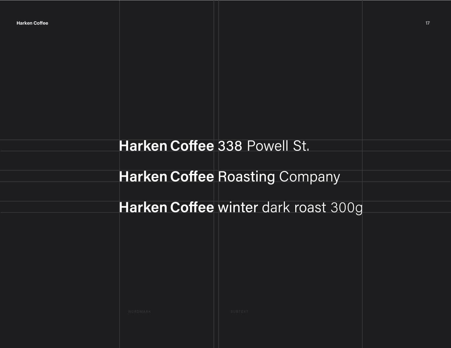
In late July of 2018, Eldric Stuart reached out to us regarding an exciting collaboration he was working on for a new coffee roasting space. This new coffee concept would become Harken Coffee, a roasting space with an attached 16 seat coffee shop and a small kitchen, located on Powell St.

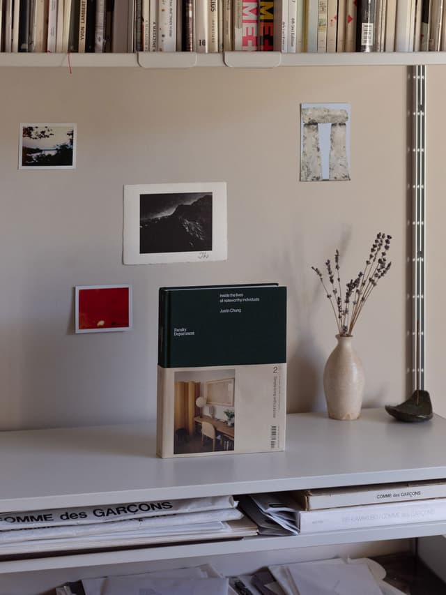
As Harken Coffee would include both a roastery company as well as a coffee shop, Eldric described his idea for a “dark and light” motif between the two businesses. The Powell St. interior would take on the darker theme while the roastery was meant to reflect a bright and meticulous approach. With these two themes in mind, we began our research through photo moodboards and tried to articulate the “feeling” of each space through the photos.

Inspiration: Gradient, Blurred effect evoking a sense of atmosphere or feeling.

Moodboard and references during our design process

Eldric had come up with the name “Harken”, which means to “recall or remember of a time or moment in the past”. We felt the name was a great fit for the coffee brand, as coffee often reminded us of a pleasant memory in the past; a conversation with a friend or just a great cup of coffee.

While we thought about how to translate this idea visually, we had came across visuals of an object behind frosted windows. Similar to how our memories can sometimes be unclear, the visual behind the window is blurry and diffused, but the overall impression and feeling is expressed. The frosted glass would blur the subject behind it and often create a gradient of colours. We applied this gradient approach to the packaging boxes of Harken’s season-based coffees. By mixing a selection of colours for each box, we found this to be an effective way to express a feeling of each season as well as the taste notes in the seasonal coffee.

Continuing with the gradient concept, we utilize a range of type weights from Acumin Pro to create a gradient type system that could be used throughout brand elements. Just like the variation of taste notes in a cup of coffee, the semibold, regular, light and extralight weights help to expand the visual experience of the Harken brand.

The stunning design for the interior is completely credited to CÒMH-A and Simcic Uhrich Architects (SUA) and built by Milltown Contracting. Our team only met with CÒMH-A early in the process to discuss the design direction and ensure that both the brand direction and the interior design would reflect the same vision. It was amazing to see the Harken brand realized in a physical space where customers can experience the brand spatially, using all of their senses.

Interior details at the entrance of Harken Coffee