Studio Kardum

Brand Identity, Website

2020

  • Branding,

  • Identity,

  • Website

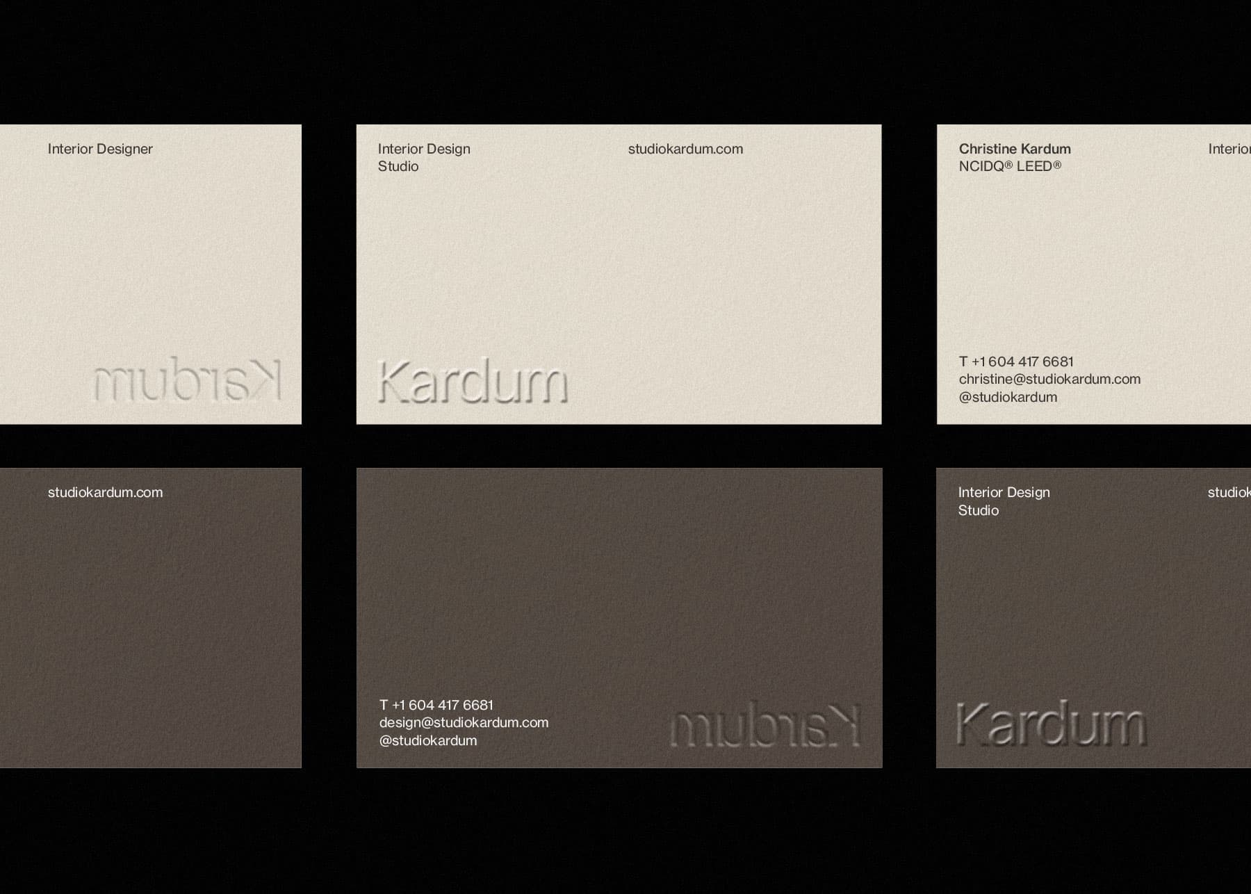
Studio Kardum is a Vancouver based design studio providing full-service design for real-estate development, corporate, hospitality, and private clients.

With 15+ years of experience in interior design, project management, creative direction, and styling, Owner and founder Christine Kardum is no stranger to the interior design industry. While her work has played a significant role in shaping the city, Christine never had a proper visual identity created for her design practice. Christine reached out to us during the beginning of lockdown, and while it was strange not being able to work together in person, Christine’s warm personality and passion for design still left an impression on us through the form of Zoom calls and emails. This definitely inspired our approach to the design of her brand identity.

1
2
  • 1

    Early sketches of the Kardum wordmark

  • 2

    Digitalized drawing of the letterforms

Brand Identity

During our discovery phase, we identified one of Studio Kardum’s brand pillars as being “inherently human”. Those words truly resonated with our team and led us into exploring humanist sans serif typefaces that provided a contemporary yet natural appearance. We decided to design a custom humanist font, creating a limited set of letters to make up the Kardum wordmark. After creating the wordmark for the full name as “Studio Kardum”, we decided together with Christine that her surname “Kardum” would be unique and strong enough as a wordmark. Using just her last name as the wordmark also reinforces the idea of a personal and intentional aspect to her brand.

To bring contrast to the organic wordmark, we use Neue Haas Grotesk as the main brand typeface which provides a more neutral and grounding tone of voice in all brand documents and reflects the restraint and understated nature of Christine’s design approach.

During our conversations, Christine mentioned how the simple act of creating division in a space can evoke different feelings about that same space. This sparked the idea for creating a simple grid system that can be used as a subtle visual element on print and screen collateral. By drawing lines that dissect a surface area, we are in the same way, dividing up space and causing the space to be viewed in a new light.

Design system inspired by the grid system, a connection to interior design and how space is divided up with intention

(Right) House visualization

Website

The design of the Studio Kardum website mimics the idea of a house with its different rooms and divisions. Using this visual motif, we aimed to evoke the emotional feeling of entering a home. We envisioned opening the entrance door into a beautiful, spacious, and relaxing living room 1 (fading image carousel). Continuing to walk past the corridor, we entered a room adorned with framed artworks and a window facing a small backyard 2 (featured projects section). The artworks guide us down the staircase 3 where we find a wall of bookshelves 4 (project index). This approach helps us create content pacing and establish a more deliberate approach to the grouping and presentation of information.

Carrying the brand system forward, the website design utilizes the visible grid structure, displaying both the vertical and horizontal lines that divide up information on the page.

The website features a very simple three page menu in ‘projects’, ‘studio’ and ‘contact’. With the understanding that interior and construction work often takes time, the projects overlay showcases both completed project case studies and in-progress projects to provide a fuller picture of the full body of work at Studio Kardum. Each project page also includes an area to highlight the materials used within the project as a way to offer greater details into the design process of each build.

View More Projects