Stranger Agency

Brand Identity

2020

  • Art Direction,

  • Branding,

  • Identity,

  • Website

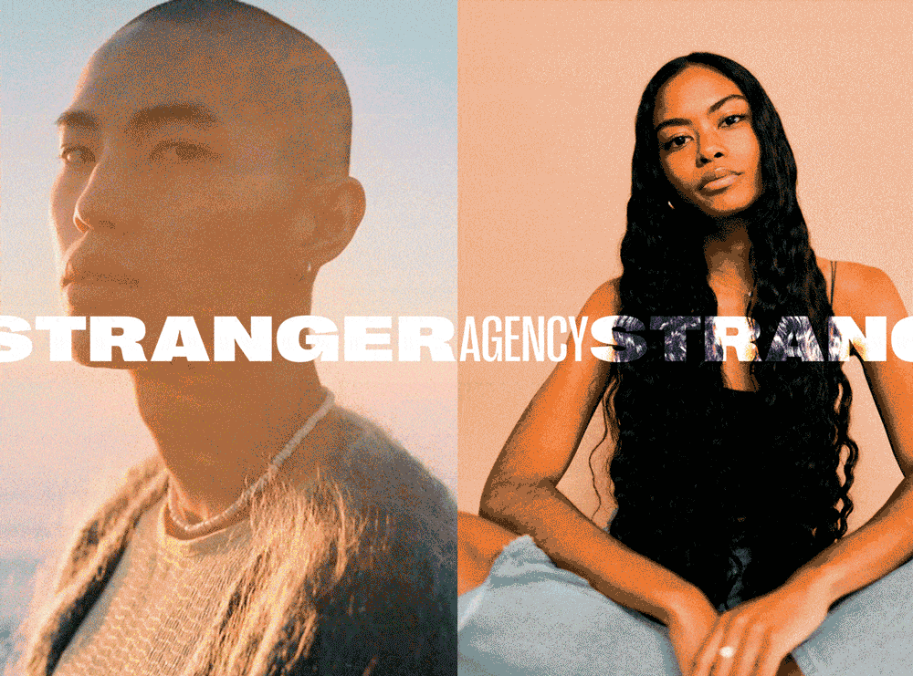
We’ve been fortunate enough to work with Gaby Bayona, owner of Oremony Design Corp. on several of her endeavours (Truvelle, Aesling, Halseene, Lovenote, to name a few) so when she asked us to take on the rebrand and site design for her modelling/artist agency, Stranger Agency, we were more than happy to contribute to such a meaningful and important project. Stranger agency grew from the need to find unique local talent for her other businesses, and has continued to grow into one of Vancouver’s go-to boutique agencies (we’ve worked with Stranger Agency for other client photoshoots in the past).

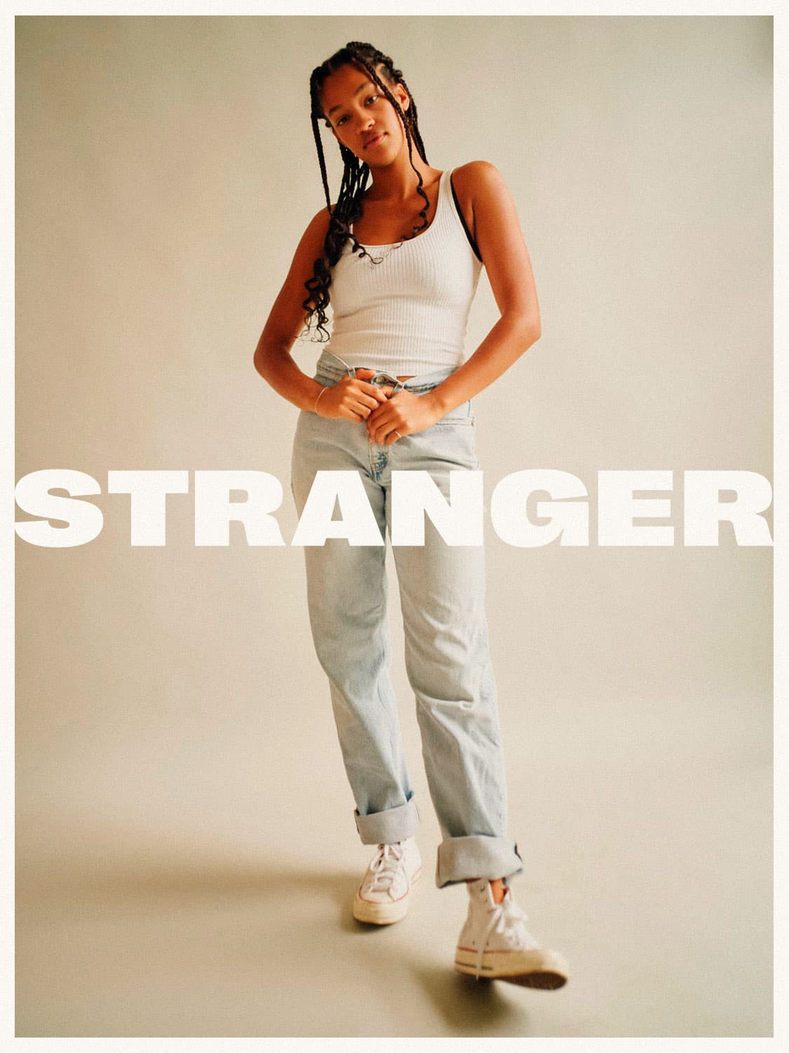
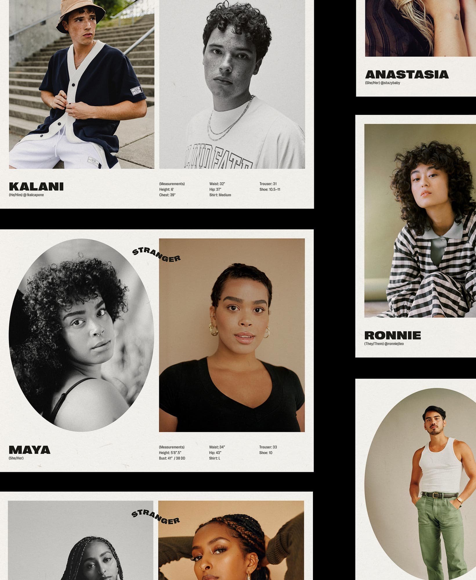
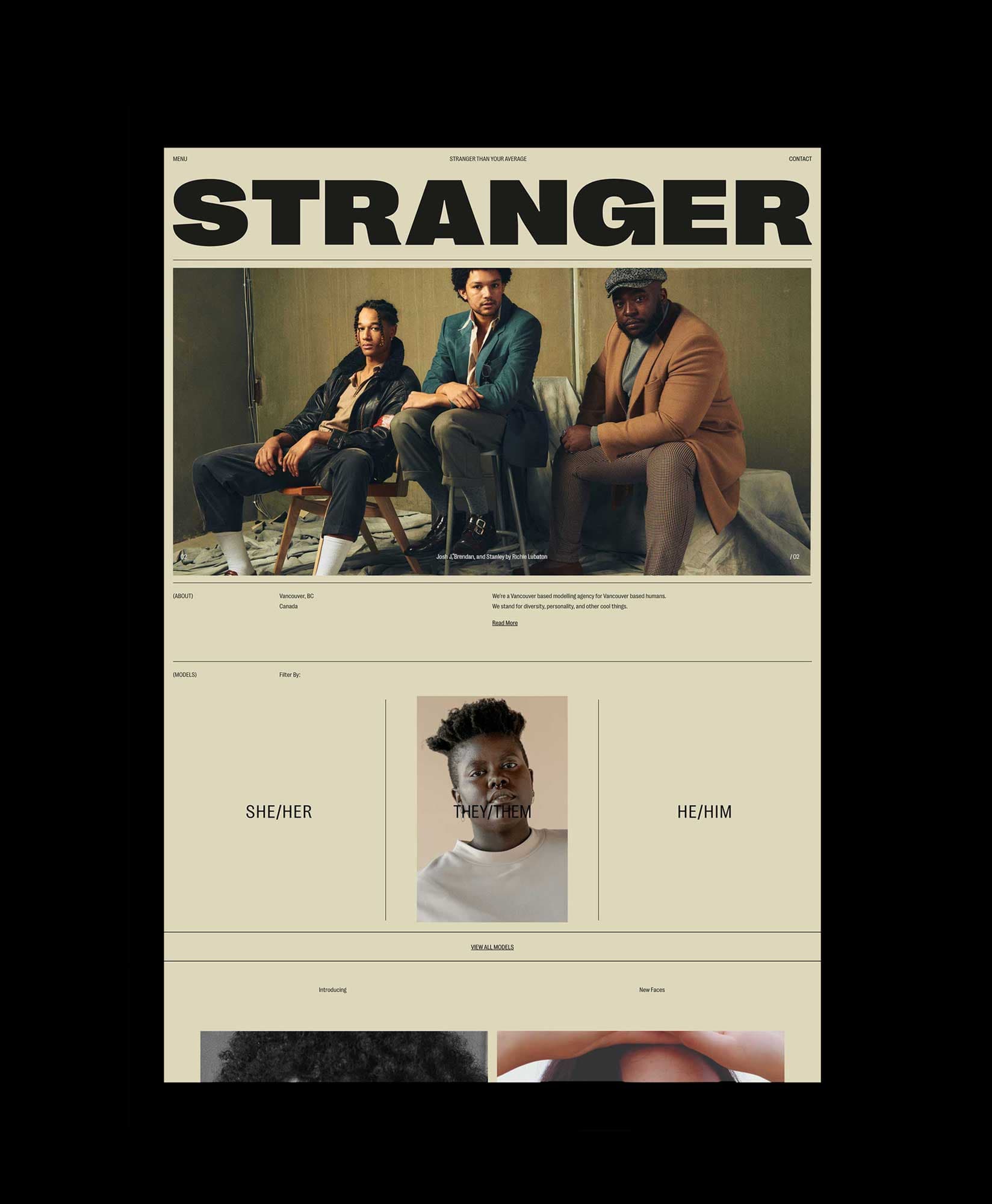
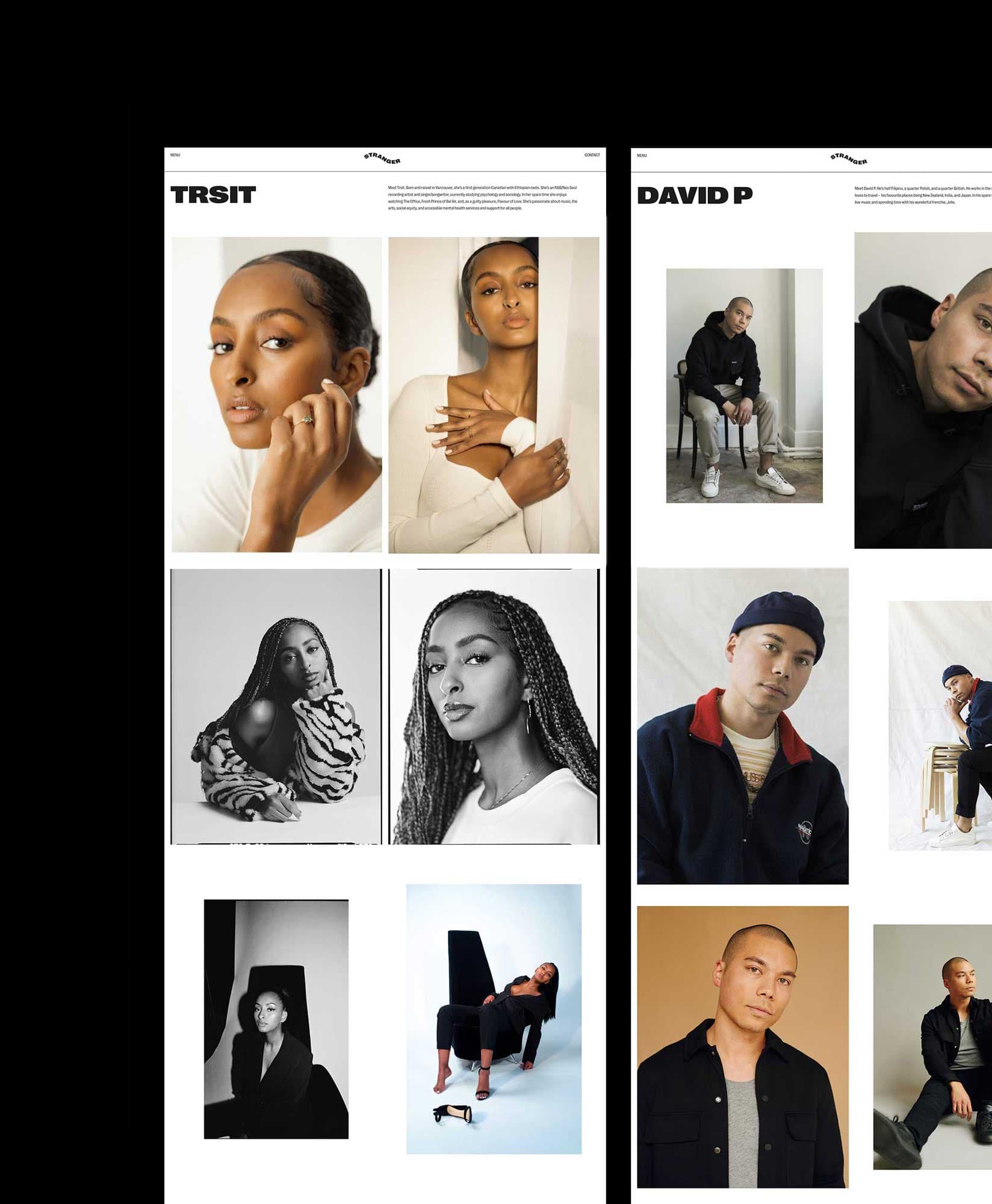
“Stranger Than Your Average,” Stranger is a Vancouver-based modeling agency representing a diverse selection of talent across a variety of age, size, ethnicities, pronouns and abilities. Stranger is founded in promoting the many types of beauty in the world and is also redefining beauty in the process.

Visual moodboard from our discovery process.

Early digital sketches

Branding

Our brand concept for Stranger is inspired by the idea of seeing eye to eye—embracing each others differences while meeting at a shared place of acceptance and belonging in the strange. This concept encapsulates holding space to understand, accept, and represent for all those who have been fighting to be seen and heard, redefining what beauty means in the process. It is confrontational, unapologetic and disruptive of what we see as normal. Through photography, graphic elements, and bold type treatments, this concept aims to highlight the unique characteristics of each individual, while working together and uniting under the common thread of being imperfectly human.

The final brand identity includes three versions of the wordmark that can be used interchangeably throughout brand collateral. In addition to the various weights of Right Grotesk (narrow and wide versions), we also utilized an outlined version of the Spatial Black weight to add to the visual diversity of the brand. As part of the graphic system, an oval shape is used repeatedly throughout the brand as a way to uniquely crop an image, a way of grouping information or as the outline for a button on the website.

Website

The brand direction and visuals were translated to the Stranger Agency website design. Developed by our team in-house, we strived to include subtle movements and interactions in the website to give the site a unique and interactive experience. In celebrating each model’s preferred gender neutral pronouns, the site categorizes talent by “she/her”, “they/them”, “he/him” and highlights new models under the “new faces” category.

The model page is set up with an array of layout options allowing each model page to be unique composed. Viewers can switch from lifestyle photos to the model’s digitals by clicking the digitals link at the bottom of the page.

(Above) Homepage Design