Equilibrium (EQ) is an award-winning structural consulting firm with a passion for sustainable, responsible design. As an international leader in timber innovation, they believe good design should minimize environmental impact, while correspondingly making a positive contribution to society. Equilibrium offers a range of structural engineering consulting services ranging but not limited to mass timber design and life cycle analysis of structural systems.
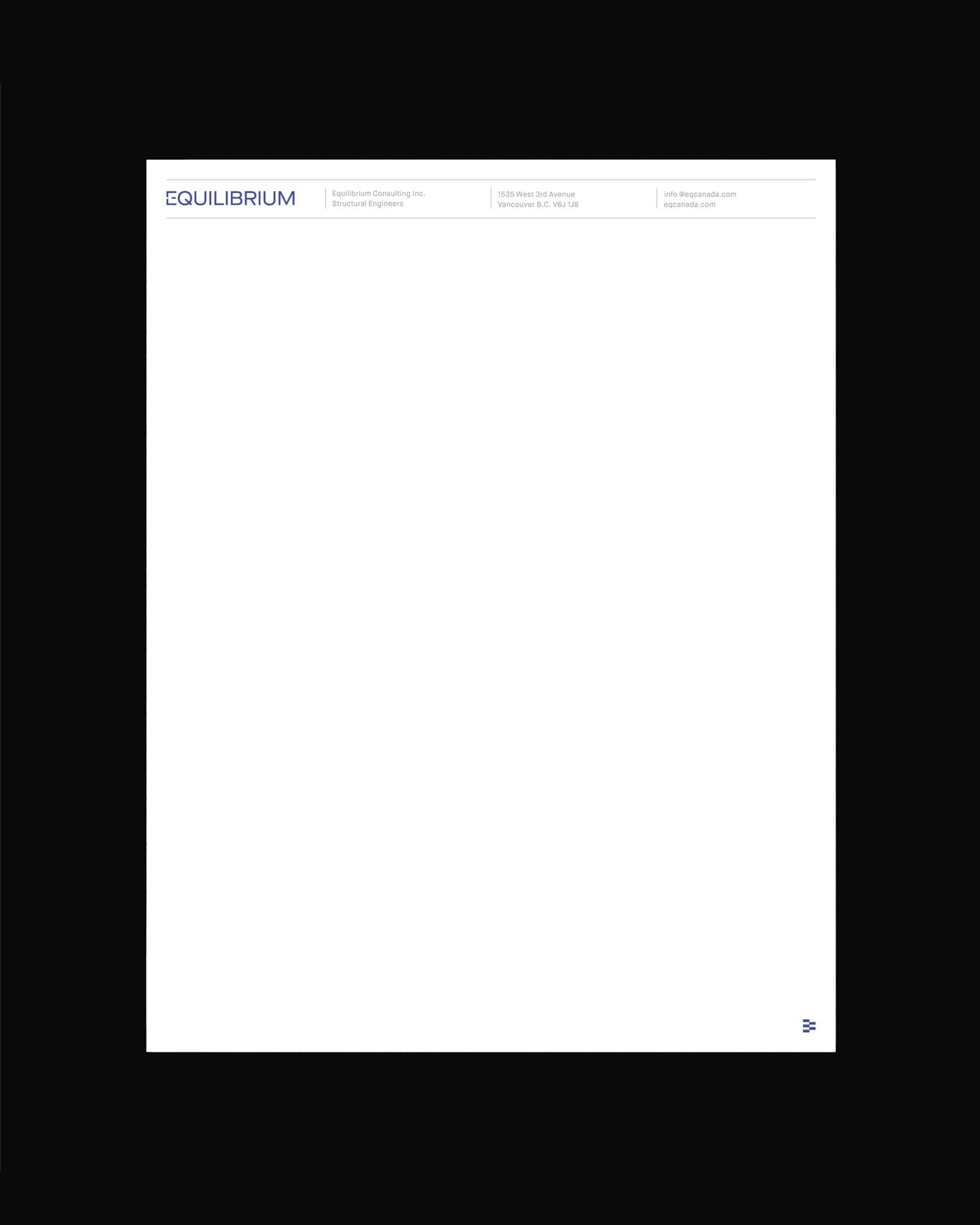
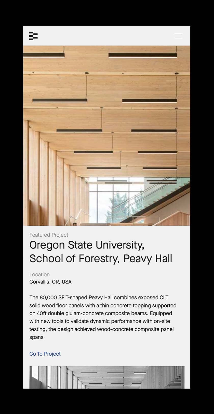
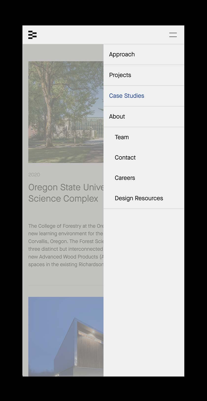
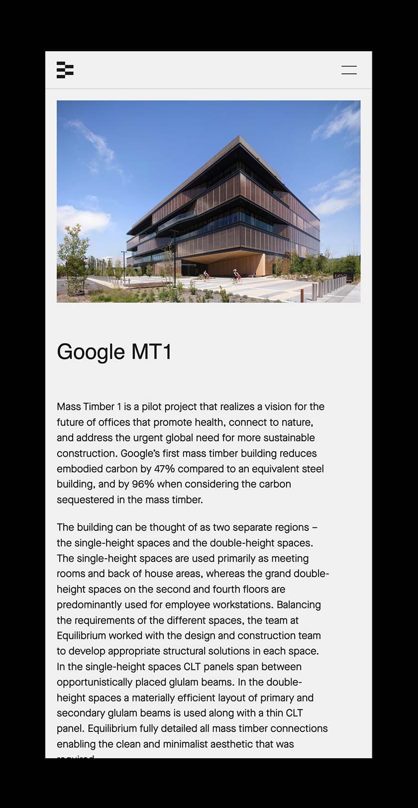
Despite their impact and recognition in the industry, Equilibrium’s existing brand identity did not appear in step with their work and aspirations. Their team reached out to us in the summer of 2020 to explore a rebranding process and new website for the company.
In our discovery phase, we decided to position Equilibrium within an ecosystem, as it acknowledges how EQ’s core values and approach is propelled by contributing to the greater sustainable impact. As engineers and consultants, EQ recognizes the work is not done once the project is complete. The full life cycle of their work is considered from inception to death—how the structures they help to produce become a part of the community and the larger ecosystem. This holistic approach enables EQ to explore new technologies and developments while also working effectively with architects and their collaborators.


