Cereal Magazine

Publication Design

2019–2021

  • Art Direction,

  • Print

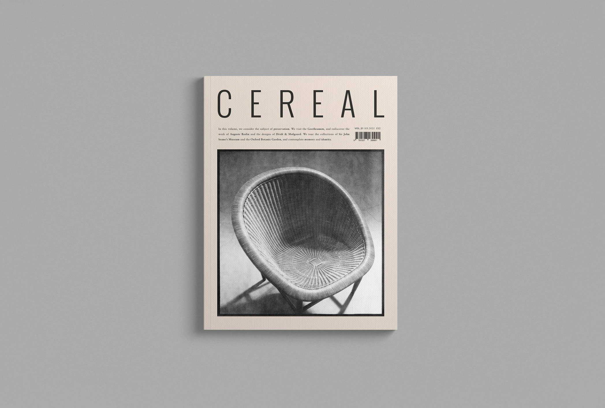
Since our collaboration with Cereal on their first self-published book, These Islands, we had the opportunity to help redesign a number of their printed city guides as well. In March of 2018, Cereal proposed another exciting project—the redesign of Cereal Magazine for the launch of volume 16.

As we approached the project, we understood the impact Cereal had made on the creative community and beyond. With a massive following that loved the magazine for their distinct minimal aesthetic and perspective, we were careful to respect their global readership while assisting Cereal to establish the next evolution of the magazine. It was important to us to understand the core of Cereal, what makes it what it is, as a way to redesign with integrity and reverence for what came before. Whether seen in print or online, the photography approach was one aspect that was distinctly Cereal and iconic to their brand. We wanted to create a design to achieve that same level of thought and simplicity, an iconic design that was distinctly Cereal.


Type Treatment

During the research phase, we observed that most magazine layouts are filled with large contrasting headlines with small text as a way to establish hierarchy. However, when we were mocking up spreads with this type treatment, we found it took away from the calmness and simplicity of the photographs and writing. Through several iterations, we challenged ourselves to create a sense of hierarchy through a different approach — a hierarchy with as minimal amount of type size variations as possible. This resulted in majority of the magazine, from title to body copy, to be set in a serif typeface at 8.5pt and credits/captions set in a 6pt sans serif. We were still able to achieve the page hierarchy through the use of negative space. Another adjustment we made was changing the previously justified paragraph styles to a ragged edge for enhanced readability and adding a line to indicate the end of an article.

Moodboard during our early explorations.

Table of Contents — At the start of the project, Cereal wanted to do away with organizing articles by categories (cities, art & design, style, etc.) as it was restricting for the content they wanted to create. Removing the categories lead to a restructuring of the magazine and in turn the table of contents. The new design features a numbering system to keep track of each article along with a restructured layout for the new types of content. Without section breaks between categories, Rosa came up with the concept of page breakers (morning, afternoon, and evening), which we placed at the top of each column.

Interviews Treatment — Among the notes we took looking over the previous issue, we found there was an opportunity to improve the formatting for interviews. We wanted to further distinguish the voices in these articles, between Cereal and the interviewee. While we kept the use of initials for Interviewees, the new design displays Cereal’s dialogue indented and set in italic.

Image Captions — We utilized the two typefaces (serif and sans serif) together in the image captions as a way to differentiate the content. We used arrows to indicate the image in which they were referring to.

Page Breakers — When we designed the page breakers, morning, afternoon and evening, we wanted to visualize the passing of time. Each title is placed with intention, descending along the right edge of the page. A small graphic detail accompanies each reflecting light and the movement of the sun for each of these moments.


To create simplicity, it often requires the practice of showing restraint. Such is the case for the beginning of the project in setting the foundations of Cereal magazine’s structure. The working file itself must be simplified and well structured, just as a clean kitchen would serve clean food. The foundations of the redesign are structured by a consistent eight column grid; a limit of six type styles/treatments for all varieties of text; and three grey tones.

When we set out to redesign Cereal magazine volume 16, we knew we were only enhancing what was already in existence. The photos and writings of Cereal continue to be the heart and soul of the publication. We simply wanted to elevate the design to match and embrace the content.

Photo credit: Rich Stapleton